Bailey03's WIP

Bailey03

Well-known member
Thanks for the link to the pict designs. I haven't decided on what I'll use yet so it's nice to have some more options.

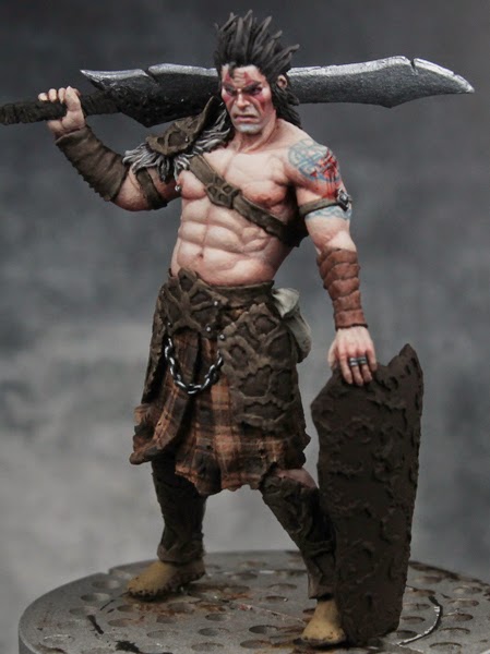
Actually, the tartan really wasn't that bad. The cloth on this figure has some minor curves, but it's relatively flat. That's definitely something to keep in mind if you want to try a tartan. Find one without a lot of folds. Pegaso has that 75mm scottish highlander where the cloth goes over his shoulder, gets all bunched up as it's tucked into his belt, and has tons of folds all over. That would be a really tough one to tackle.

Here is was pretty flat, so I just had to lay down the main set of horizontal and vertical stripes and then I could use those as a guide for the rest. Took a bit of time of course.
Tartan_01.jpg

Tartan_05.jpg
 

Dragonsreach

Super Moderator
Staff member
I'm just liking the fact that you've gone and used a traditional colour pattern for the Plaid.
People forget that the modern colour patterns we regard at the Clan Tartans only really became 'vogue' with the Scottish revival and better availability of coloured dyes in the 19th century.
(Yeah one of my uncles is/was a design lecturer specialising in clothing up in Edinburgh, married a "Traditional Scots Lass"......Porridge with Salt, a Dram with bread )
 

Zab

New member
That reminds me there's a new audio book from that series out or due out soon :) I need a break from all the incest in Game of Thrones o_O
 

Digganob

New member
Lol. I finished the last book a couple of years ago so when he puts the next one out (when ever that might be) i shall be ready. Till then I shall enjoy a second reading of the iron Druid chronicles.

Also still loving your current project bailey.
 

Milosh

New member
damn man, that Napoleonic figure is awesome, those reds are incredible. This new guy you're working on is also fantastic, the tartan is top notch.
 

Bailey03

Well-known member
Thanks for the link, DR. It's some really helpful info. The designs are a bit too complex for this scale (at least for my abilities), but I'm going to try a simplified version of the arm bands. I'm not familiar with the books but sounds like I should check them out.

Hey Milosh, nice to see you checking in here at CMON! I've been keeping an eye on some of your work over at facebook. I really liked your zombie scene and the cowgirl is pretty sweet too.
 

Bailey03

Well-known member
Thanks, Demi. Well, I had a go at the tattoos. DR's links were great, but those patterns would be tough to pull off on a figure twice this size! So I went for a design on the shoulder which I think means shield. And then a simplified band on the arm. It came out a bit light in the photos so I may have to go back in and darken the band up a bit.

G24.jpg
G26.jpg
G25.jpg
G28.jpg
 

Zab

New member
Nah they look like old tat's - don't mess with them too much more or they will look too new or painted on.
 

Bailey03

Well-known member
Just some minor progress, with the tattoos finished I went in and took care of the sculpted in scratches on his shoulder.
G30.jpg
G31.jpg


I'm slowing a bit on Slaine, so I picked the Officer of the Guide back up and did some more work on him. I took care of the base (mostly) and then gave the boots a shot. I wanted a shiny black look and I think it turned out pretty well. The scabbard had been in the way, but with the base and boots taken care of I glued it in place and painted it with the Scale75 metals. I've got a couple small details to do and then it's on to finish up the hat.
OG21.jpg
OG22.jpg
OG20.jpg
 

Zab

New member
Lord fancy pants is nice. I love how the metals look on the guy in the dress already too :)
 

Dragonsreach

Super Moderator
Staff member
Treble Respectto you Bailey, that is excellent work.
Really appreciate the 'feel' of both these figures, totally different genres with great painting.

If you do go to read the Iron Druid chronicles be aware that the Erin Gaelic spelling can be a bit difficult to get your head around.
I did the audiobook route first so it was better for me plus the vocalisation of Oberon was captured perfectly by Luke Daniels.
Hasn't stopped me reading the books though.
 

Silverwulfe

New member
Actually... thanks DR... I forgot I had those on Audible, and that works much better to paint to than fiddling with movies. 3/4 of the way through the first book again and have the next two in my library from when they came out. I'll have to listen to them all again and then add the next ones. I also have the books, but wrapping your mind around the spelling is difficult, until you've heard them. I like Oberon too... makes me smile even in the middle of heavy concentration.

Really like the blood, though I would have been nervous putting that over that great tattoo! Amazing reds on the Officer. I have been hit or miss on reds... either I get them too thin or they end up shiny for hours (still waiting on the last one to dry... unless it already has and is shiny). Are there any good tutorials on using reds? In my case, I'm painting a zombie with Warpaint Pure Red (cause my wife wanted one of the female zombies to be the Lady in Red).
 

Bailey03

Well-known member
Thanks, DR. Very kind! And thanks for the tip, maybe I'll check out the audio version first.

Silverwulfe, yeah it's a bit intimidating to go over the tattoo, but that layering of detail adds some nice interest to the figure. The trick is to just go slow and add a little bit at a time. That way you don't overdo it and ruin the underlying detail. Oh reds can definitely be a pain. I've found the Vallejo reds tend to have a satin finish and remain shiny even when dry. To deal with that I bought the Andrea red set a while ago and was quite happy with it. Lately I've been using the Reaper reds. The above work was Reaper's Burgundy Wine for the shadow, then into Violet Red, and the Fire Red for the highlights. The top highlights were Fire Red with a bit of Fair Skin mixed in.

For shadows, dark purples or blues can produce a nice effect. Highlighting is tough, if you add white you end up with pink. If you add yellow, you get orange. So one solution is to make the whole red area darker and then just use your brightest pure red as the highlight. I think you can get away with using other colors to highlight (light yellow, orange, skin, etc). If you don't go too far then the result should still look red. Here I used a bit of light skin and the highlights became a little pink, but since the area applied was limited the whole thing still reads as red. Another trick is to find a nice red glaze or ink and use that after highlighting to bring the tone back to more of a red. I've got the GW Bloodletter red glaze and have used that on my scourge to take the pinks back to red. Inks can be really powerful but have that satin finish which you're trying to avoid. So unless you plan to use something like dull cote, maybe skip the inks.

You can also check out the color specific tutorials over on tutofig. They've got a couple different ones on red, so perhaps you'll find one of them helpful.
http://tutofig.com/painting/theory-tools/focus-on-a-specific-color/
 

Silverwulfe

New member
Thank you! I know it will take time, but I am learning something every day. So glad I finally dove off into this ... hobby? Lifestyle choice? Madness? Really looking forward to what I can learn next! Awesome community with so many helpful people too...
 

Dragonsreach

Super Moderator
Staff member
I'm hearing you in the red's Bailey, sometimes a right royal pain in the Peegu!
I've found with watercolours that a thin wash of a yellow as a base give red's a bit more brilliance, not sure if that might work with our model acrylics.

But..using VMC red's I've glazed with VMC transparent yellow on raised areas gives a nice highlight without going overboard.(cloth wise at least) I have in the "to do" pile an Eldar Farseer, which WILL be RED and I already have the plans to use VAirbrush Mahogany to darken down from the brightest red. Gonna have to see how that pans out.
 
Back To Top
Top