You are using an out of date browser. It may not display this or other websites correctly.
You should upgrade or use an alternative browser.
You should upgrade or use an alternative browser.
Bailey03's WIP
- Thread starter Bailey03
- Start date
Gandalf the Grey
New member
The essence is the quality of your blending, it is literally without fault and a huge learning curve for us lesser mortals. Like your face work on your previous projects, I'm always in awe how you blend the reds in the cheek to the highs in such jaw dropping smoothness. I would sincerely love an article from you on how you achieve such stunning blends.
Bailey03
Well-known member
Thanks!
Mally, I wish I had some awesome time saving tricks to share on blending. Most of what I do involves applying thinned down layers (not as thin as the transparent glazes, but certainly not opaque layers either) and just gradually shifting the color on the palette for each new layer. In areas where the blends need fixing, I'll mix a gradient of the colors on my wet palette and jump back and forth between the lighter and darker shades until the transition is hidden. This isn't exactly wet blending, but there's a probably a bit of that which can help.
I've been meaning to do a video tutorial. I had recorded one of the hobby hangouts, but doing it that way left a lot to be desired in terms of video resolution. The audio was a bit spotty too. If I record directly from my camera that should fix both of those issues. I'm not sure when I'll have time to do this, but that should be the best way to show anyone interested how I blend.
Sicks, hmmm... I hadn't thought of that, but perhaps I will. I was experimenting a bit with this piece and trying to do shiny black hair. I approached it more or less like NMM (even though I don't really paint NMM). The reflections fall about a third of the way down instead of at the top. This is more about a ray of light bouncing off and where it would have to be for it to travel from the light source to your eye (with angle of incidence = angle of reflection) rather than regular zenithal lighting where the upward facing surfaces are always the brightest. The other trick is to vary the placement slightly so the lights aren't all perfectly aligned around the head. I'm not a NMM expert like a number of other painters on this site, so I'm still trying to figure it out as I go!
In other news, instead of starting on the angel's wings, I decided to start painting the Dragoon I showed a few pages ago. I've finished his face and started on the helmet. No pictures yet, but I'll try to get some up in the next day or two.
Bailey03
Well-known member
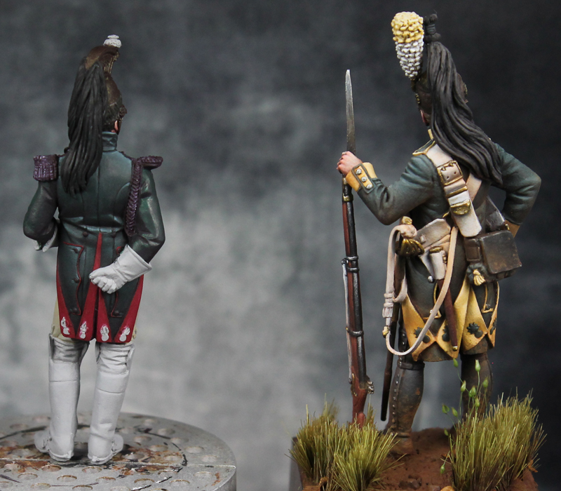
I took a few pictures of the Dragoon after last night's painting session. This is a 54mm Pegaso figure representing an officer in the Empress' Dragoons (part of the Imperial Guard). I started with the face using my usual process. A few details have been painted on. I added the cleft in the chin just with paint (he's got a big chin, so it was nice to add a little something there). I also did a big of highlighting on the side of the jaw to make it look like his face was being pushed/scrunched up by the chin strap.
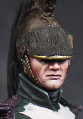
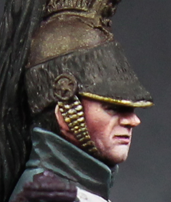
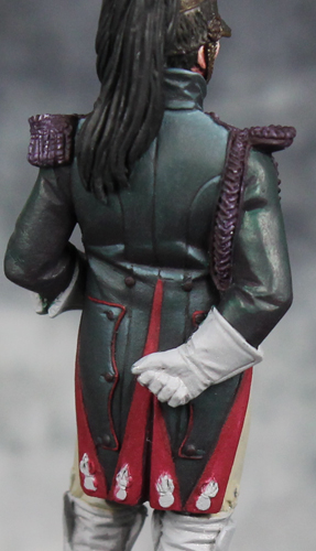
From there I started working on the coat. It's still very much a work in progress, I haven't started on the sleeves or front yet, but I've put in some time on the collar and back. The color should be a dark green. Dark colors like this (green, blue, etc) can be tricky to paint. As you highlight them, they can easily start to look like a medium or even a light green. To counteract this, I use grey to highlight rather than a lighter shade of green. This desaturates as it lightens, which helps keep the overall look a dark one while still giving me a decent amount of contrast. For the shadows I mixed in Reaper's Burgundy Wine. The dark purple is a nice contrast to the green and provides additional depth/interest to the shadows without actually looking like purple.
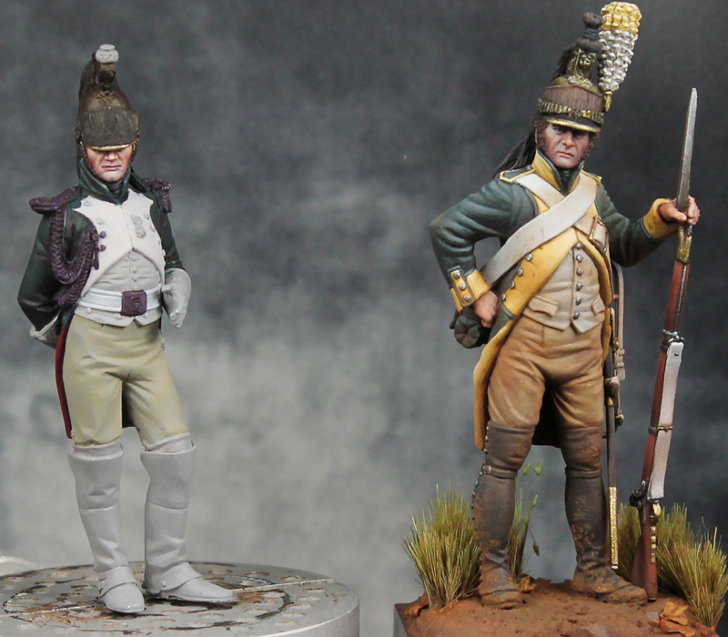
You may remember that I've painted a French dragoon before, almost two years ago. Here's a comparison of the new figure with my other Dragoon. The new figure is a bit smaller (despite being the same scale). You can see some of the differences in their uniforms. The general approach to the green coat is the same, though on this new one I've tightened up the transitions from dark to light. It gives the newer version an even darker look and also makes it appear a bit shinier... which fits, a clean officer's dress uniform should look nicer than a trooper's worn campaign coat.
From there I started working on the coat. It's still very much a work in progress, I haven't started on the sleeves or front yet, but I've put in some time on the collar and back. The color should be a dark green. Dark colors like this (green, blue, etc) can be tricky to paint. As you highlight them, they can easily start to look like a medium or even a light green. To counteract this, I use grey to highlight rather than a lighter shade of green. This desaturates as it lightens, which helps keep the overall look a dark one while still giving me a decent amount of contrast. For the shadows I mixed in Reaper's Burgundy Wine. The dark purple is a nice contrast to the green and provides additional depth/interest to the shadows without actually looking like purple.
You may remember that I've painted a French dragoon before, almost two years ago. Here's a comparison of the new figure with my other Dragoon. The new figure is a bit smaller (despite being the same scale). You can see some of the differences in their uniforms. The general approach to the green coat is the same, though on this new one I've tightened up the transitions from dark to light. It gives the newer version an even darker look and also makes it appear a bit shinier... which fits, a clean officer's dress uniform should look nicer than a trooper's worn campaign coat.
BloodASmedium
[img]http://pnp
I think your a pro now!!! Have been the last 3 years.your a brilliant man and a wonderful friend and the hobby imho would not be same without your contributions buddy
fluisterwoud
Active member
Angel lady's skin looks excellent, great blending. Looking forward to this new Dragoon too, your historicals are the best.
stampedingviking
New member
Those dragoons look great, especially with the green being kept dark.
Bailey03
Well-known member
Thanks, all!
BAM, ha, well when I see work from people like Ben Komets I still feel very much like an amateur!
Sicks, I've had the urge to do some more fantasy themed pieces. I guess the angel is one, though I'd really like to do some more traditional fantasy pieces. I've got a couple in mind, but they tend more towards big involved projects (which I'm not quite ready to undertake). The dragoon is a pretty straightforward project, nothing too involved which is nice. I'll have to keep an eye out for some fantasy pieces like that.
AndyG, I'd love to get out there for that. One of these days I will... though, sadly, it might be a few years before I'm able.
Great work Bailley.
I think you are right next, if not above Ben Komets, if you ask me. It's just that each one has his own style, and it's only human to find your own work less appealling then that of others at the same level. Great idea to highlight the green with light grey, absolutely love it. I would have used sunny skintone which wouldn't have been nearly as good as yours.
Excellent work,
Gino(2dope)
SaintToad
New member
I've had the urge to do some more fantasy themed pieces... I'd really like to do some more traditional fantasy pieces.
Alright!
Dwarf pirate still my favorite of yours, despite the beauty of your historical stuff.
KruleBear
Active member
Yup, I am with BAM and the rest on your awesomeness. i like the darker green. Will also give a nice variety in th display cabinet.I think your a pro now!!! Have been the last 3 years.your a brilliant man and a wonderful friend and the hobby imho would not be same without your contributions buddy
")
Bailey03
Well-known member
Thanks, all!
Well, you may have noticed I've been away from the forum for the past few weeks. My wife has been working on a mini-project of her own. Introducing little Colette, born June 22, 2016!
View attachment 50526
Needless to say, I haven't had much time for painting. I've snuck in a few hours here and there, but that's about it. Of course, when she's older, I'm thoroughly looking forward to getting her into the hobby too. It'll be the start of Studio Powell! Look, she's already contemplating which mini she wants to start painting first...
View attachment 50527
