Bailey03's WIP

Darthmarsh

Active member
This has the same 2D illustrated effect that Marc Masclans amazing Papa Jambo bust has and that's a very good thing. Simply incredible work
 

Bailey03

Well-known member
Thanks! Masclan's Papa Jambo bust is definitely something worth striving towards!

Here's a minor update. I continued with the basic (normal lighting) skin. The left side of the head around the back and his neck previously had not been finished. I also took care of the top section of his right ear (where a bit of normal lighting falls). And, while I was at it, I fixed that line on the right side of his forward. It was much too sharp previously, so now I've smeared out the shadow. A few other minor touches... I painted his teeth. I also played around a bit with the OSL side. It's no where near being complete, I just made some minor adjustments and did a bit of blending. I'm still trying to figure out exactly how I want to do it (how much light, how bright should the highlights be, how far should the blue tint extend, etc).
View attachment 52186View attachment 52187View attachment 52189

Here's a side by side on the OSL portion of the face. I think the blue glow and how it's blending into the skin looks decent (will probably still adjust things), but brightest parts on the new version are a bit too dark. I don't want to lighten up everything, I just think the top lights from the OSL should be brighter and have a sharper transition from dark to light. My other concern with the OSL is the edge lighting it creates. So when you look at it from the other angles (photo 1 and 2 above), the OSL acts as an edge light. I think creating a sharper transition from dark to light (with the lights being brighter) will also improve that effect. Anyway, those are just some of my thoughts. I'm still figuring it all out as I go, so we'll see how it continues to develop!
View attachment 52190View attachment 52188
 

Hairster

New member
Still struggle to look at this as anything other than a piece of two dimensional painting every time I look at it. Reminds me of a piece of pre production character concept art from a film or tv project.

Exceptional
 

SaintToad

New member
Bailey, your bust is looking terrific, man. I know I and many others get a lot of praise intended to push us higher, but the praise I'm sending your way is just supposed to be a fair assessment of what you're doing. I'm genuinely floored by what you're doing.
Woud you say that your technique on this bust is essentially the same as the technique you'd apply on a historical piece, or do you feel you're actively modifying your process to achieve a different look?
 

Bailey03

Well-known member
Thanks, everyone! Lots of very kind words!

SaintToad, yeah, in general I try to approach historical figures in the same way. I think it's a bit easier for me to experiment on fantasy subjects and push myself. In some ways they can be more forgiving (say if the result is more cartoony or stylized than realistic, that can often work fine for fantasy but less so for historical). Here I'm really trying to recreate a 2-D effect in 3-D with the OSL and edge (or rim) lighting. That's a bit easier on the fantasy figure as I can just put in a blue light and we assume its the glow from some magical artifact or spell. With a historical I have to work harder to justify it. Still, the main light on this figure is similar to 3-quarter lighting (at a slightly higher angle so it's a bit more harsh). In 2-D painting and photography, 3 quarter lighting is commonly used for portraits. So I think that can easily work on busts for both historical and fantasy pieces. That hard part is what do you do when viewing the figure from the angle away from the light? So for a historical I'd want to add some sort of reflected light from the other side to work as both an edge light and to make the figure viewable from that other angle. In the end, I hope to apply the lessons I'm learning from this figure and Redghar and find a way to apply them to my historical figures too.
 

Darthmarsh

Active member
Hmmmmm not sure. I completly understand where you're coming from with the edge highlights but I think it's already very believable. He may benifit for a slightly brighter blue but not much. The effect as it is looks great. A diffused, standing at the bottom of the heroins bed lit by an overcast moon through net curtains, rather than outside lit by a full moon (which to me is wasaaaay creepier)
 

Bailey03

Well-known member
Thanks for the feedback, Darthmarsh. I was actually thinking the glow was from some magical item he's holding (or something like that) since it's coming from below him.

So I ended up revising the OSL like I said. The first couple pictures are from the regular lighting side where the OSL works more as edge lighting. And then we focus on the OSL side to see how it works when it's the focus. The neck is still a work in progress, that needs to be brightened up some to match with the rest of the face.
CM18.jpg
CM19.jpg
CM22.jpg


And so you can clearly see what I changed on the OSL, here's a side by side with the previous version. There are a few very minor things I'd like to adjust, but overall I'm pretty happy with the OSL. What do you all think?
CM21.jpg
 

SaintToad

New member
Thanks for your detailed response, Bailey. Your attention to the details viewing angles is evident in the very different, but equally interesting views you've shown us. I like that the OSL effect doesn't actually illuminate the entire sections of the model upon which the [FONT=&quot]shadows from the[/FONT] 3/4 lighting fall, but just put bright, almost harsh highlights on a portion of them; this bright lighting alongside a darker, generally shadowed portion is what you're calling 'rim lighting', right?
Model looks killer, by the way!
 

Bailey03

Well-known member
Thanks, Maenas and SaintToad! SaintToday, yes, when viewed from the front or at a slight angle as in the second photo above, the OSL works at a rim light or edge light. I believe those two terms are used interchangeably in photography. And yeah, I think leaving the main shadows as almost a divider between the two light sources creates a more interesting effect.

On a side note, I could use some advice on what to do about the scratches on his face. This is where having some box art to borrow ideas from would be helpful! I know that I don't want to paint them as open/bleeding wounds. But I'm not sure if leaving them as dark lines (like I've got now) is the right choice either. I was thinking, when I go back over the face with glazes, that I'd give the edges around the scratches a red/pink tint. Not bloody red, just a color shift from the normal skin to more of a reddish/pinkish skin. What do people think of that idea? Or do you think something else would look better? I'm open to suggestions.
 

bgcdazzler

New member
Got to admit I'm not a fan of this sculpt, but the paint job is astounding so far.

For the scratches I'd say that they wouldn't bleed much (him being undead and all) so maybe lighten the outside edges to suggest raised, puckered skin, keep the inside of the scratch a dark brown/red/purple.
 

KruleBear

Active member
I agree that some purplish blacks for the scars would work well, especially if you go with the spider veins you were considering. Btw nice work on getting a realistic finish on the teeth to not make them seem as goofy as they are sculpted.
 
I really commend you on the risks you are taking with this project. Trying out new techniques that many in the mini world are afraid to approach. For instance, I believe you are using something that traditional oil painters refer to as "three quarter lighting." Very popular in portraiture.

Wish that you were a bit more adventurous with you edges, with more certain edges in spots to compete with the uncertain ones (blended v unblended). Of course, I don't blame you for sticking with the accepted tastes of the times, especially when being experimental in so many other areas. Sharp edges can be very realistic though, as the demonstrate the harshness of the light source.
 

Bailey03

Well-known member
Thanks, bgcdazzler, Krule, and BFK. You're right, I'm using three quarter lighting with the primary light source. Perhaps a bit more harsh than some portraits (3/5 lighting?), but I wanted it to be extreme so there was no question what I was doing (and because I think a more extreme look suits this bust). At some point I'd like to try the same thing (perhaps a bit softer version) on a historical bust. As you said, that lighting is very popular in portraiture.

I know I'm not exactly pushing the envelope in regards to smoothness (or lack thereof), but I feel like I've got some sharp transitions too. Those are perhaps easier to see on the profile shot of the bust. Right now there's a definite interest by a number of the top painters (mostly in Europe) in getting away from the idea that everything has to be smooth. The trick is doing it in a way that is either realistic or artistic and not just because painting smooth transitions is hard. When someone like Banshee paints abrupt transitions everyone knows it was intentional and that he can paint smoothly if he wanted. I feel like I've got to establish my painting cred before I go down that road. Plus, as you noted, I'm already using a non-traditional primary light, adding in OSL, and more or less trying to make the piece look like an illustration. That's enough for one project! I'll leave the smoothness experiments for another one! ;P
 
Actually, now that I look again there are some very clear edges. Like under his nose stands out to me the most. Great job there buddy! I really can't commend you enough for utilizing such creative energies. And trust me, DP, people know your capabilities, and they would be able to distinguish between the unintentional and the artistic. Your reputation truly precedes you; I know for a fact that a number of well-known artists know of your work and admire it (heard it from the horses' mouths).

Question: Did you paint the entire face with base coat, shadows and lights and THEN add the OSL? Or did you paint the OSL directly over primer and simply blend it in with the surrounding tones?
 

BloodASmedium

[img]http://pnp
David ... Fantastic and phenomenal work. Your truly among the greatest painters ever. I concur some purist pastel punks glazes in around the body of the scarring then edging highlights of pastel pink in the scarring rims. What ever you do it will be of the absolute highest standards of model miniature painting.
 

Bailey03

Well-known member
Thanks, BAM and BFK.

BFK, nicely done with the oil painting! And yeah, definitely similar lighting to the bust... though I'd probably skip the magical blue glow on your painting. ;P

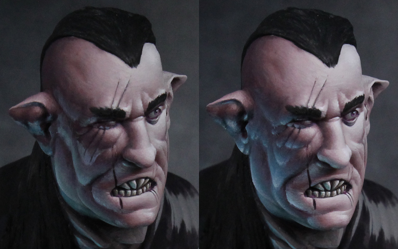
To answer your question, I started with just a rough sketch over the primer of both the primary lights and the OSL. In the areas where I knew the OSL would be the brightest (along the jaw/neck, under the brow, on the ear, etc), I didn't bother putting down the main shadows. I just went straight to the OSL color. In some of the intermediate areas (near his mouth and cheeks/side of face), I did sketch in the main shadows and then sketched the OSL on top of that. Though everything stayed rough at this stage. I did not go in to create smooth shadows in areas where I knew the OSL would be going on over the top.

As I started to refine and blend, I extended the primary shadows into the transition region between the OSL light and the shadow. But I did not go into the brightest OSL areas. With the most recent version of the piece, I did mix in some skin tone with the OSL color before applying it to the face. I mixed in a mid shadow version of the skin for where the OSL hits the darkest part of the face. Then, near the mouth and nose where we're coming out of the shadows, I mixed in a midtone of the skin instead. In both cases, I added more and more pure Ghost White to create the OSL highlights. So the base of the OSL was influenced by the skin color but not the highlights.
 
Back To Top
Top