
hey CMON...
i got the collage size issue worked out, so here is the second addition to my gallery...
it\'s kind of a drag startin\' off with the old minis...they don\'t show how i paint these days, but they do give a bit of perspective on how i\'ve chosen a style to paint, and then tried to tighten up the skills...
this guy is another that i worked on back when i lived in amsterdam...
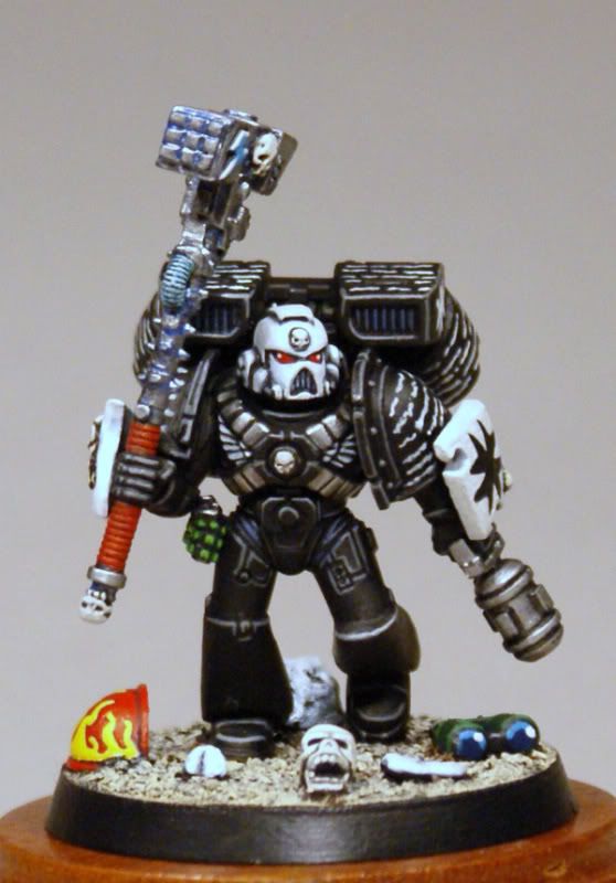
he was built right when the latest edition of the chaos marine plastics first came out(\'01?)...when i saw the ridges on the shoulder pads, i knew i would have to try \'em out on a imperial marine...
the extra bit of armour on the shoulder pads inspired the extra bits of armour on the arms, which inspired the siege theme...a few more snips, and borrowed parts later, and i had a cool conversion...
he sat in my case for a year or two before i finally decided to give him some paint...
not my best paintjob ever, but it was my first crack at a black templar, and the first time i covered a mini with so much script...
not sure how i feel about the result, but i like all the old school parts(the bits on the ground are from the old battlewagon kit, and the extra armour are from the original termie box set)...
please to enjoy:


thanks for lookin\'...
here\'s the link if ya feel like votin\':
http://www.coolminiornot.com/207814
cheers
jah
i got the collage size issue worked out, so here is the second addition to my gallery...
it\'s kind of a drag startin\' off with the old minis...they don\'t show how i paint these days, but they do give a bit of perspective on how i\'ve chosen a style to paint, and then tried to tighten up the skills...
this guy is another that i worked on back when i lived in amsterdam...
he was built right when the latest edition of the chaos marine plastics first came out(\'01?)...when i saw the ridges on the shoulder pads, i knew i would have to try \'em out on a imperial marine...
the extra bit of armour on the shoulder pads inspired the extra bits of armour on the arms, which inspired the siege theme...a few more snips, and borrowed parts later, and i had a cool conversion...
he sat in my case for a year or two before i finally decided to give him some paint...
not my best paintjob ever, but it was my first crack at a black templar, and the first time i covered a mini with so much script...
not sure how i feel about the result, but i like all the old school parts(the bits on the ground are from the old battlewagon kit, and the extra armour are from the original termie box set)...
please to enjoy:
thanks for lookin\'...
here\'s the link if ya feel like votin\':
http://www.coolminiornot.com/207814
cheers
jah

