You are using an out of date browser. It may not display this or other websites correctly.
You should upgrade or use an alternative browser.
You should upgrade or use an alternative browser.
Crystal Brush count-down - JRN's project
- Thread starter JRN
- Start date
MightyChad
New member
JRN, I don't care what anyone says, you ARE the Master. I am eagerly watching the paintjob on this conversion, just seeing the blocked in colors has me excited. Thatnks for posting this project.
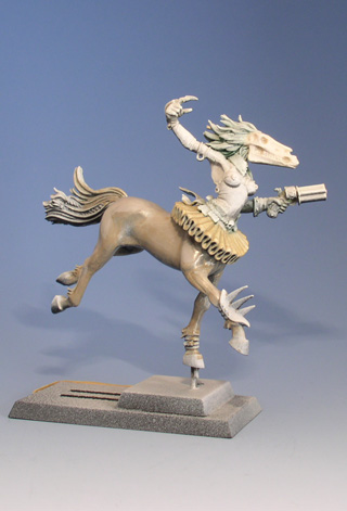
Though having followed this project closely on the Danish miniature painters scene - I couldn't resist checking this tread out as I stumbled over it. On a project this detailed you tend to see something new each time - and now this idea of applying a coat of yellow, before starting on such a transparent colour as red tends to be, is something I myself haven't considered before - hopefully it adds something to the red when that is applied.
Cheers buddy
Cheers buddy
Garshnak
New member
hopefully it adds something to the red when that is applied.
Well in theory, it should create a warmer, slightly more orangey-red red at first(especially if GW blood red is used, which technically isn't pure red), instead of a pinkish (desaturated) red tone. After a bunch of layers this should matter little, but if kept slightly transparent it can be a nice effect preferable over just mixing it with a bit of orange.
Underpainting has tons of cool things you can do, since colours interact slightly differently from either being mixed or glazed.
If followed up by a good shading with dark reds (black + red), you can get a good blood colour.
Cool that you're showing so many steps in the progress!
khavor
Member
Cool that you're showing so many steps in the progress!
Agree! Not only do we get to see a great looking mini, we might just learn something as well. Love it so far. All the sculpting is really crisp and precise, and I love the little extras. The playing cards are definitely a nice touch. Very cool!
Garshnak
New member
Using the underpainting has been a weird experience this time. Have used the technique lots of times, but I am not getting the red as deep as I want.
Well, more shading, feathering, etcetera.
Heh no, since you used a very bright yellow, the red also ends up being warm and bright (like I sort of explained in my previous post). Doesn't a bunch of dark red washes (black + red) achieve what you'd want? Also, the red in your concept 's not a pure red but closer to magenta and has a lot of black. So the yellow underpaint might not have been the best idea if you wanted to achieve that. Since the yellow moves the red towards orange (naturally) and thus away from that dark, deep red. Hmm, I wonder where a bright purple underpaint would've gotten you. Since that'd be colder, but still would give it some depth. Though...that would make the 'lighter' parts colder then the shadows and that wouldn't entirely work.
It's a really nice colour you got there though, but yeah, but maybe a tad too bright.
Also, what red are you using?
dogfacedboy uk1
New member
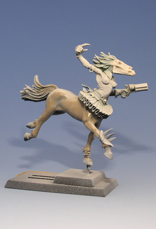
Just forgot a few extra pics yesterday:


Reveals a little of the sculpting process...
I'm glad you put those pics up, I was going to ask what method you used to sculpt it. Very nearly looks like you took the time to actually fold it lol, looks really clean. Following this one with great interest Jakob - good luck in the competition, I am looking forward to seeing photos and the write up for this show as its sure to be an awesome event.
dfb
Heh no, since you used a very bright yellow, the red also ends up being warm and bright (like I sort of explained in my previous post). Doesn't a bunch of dark red washes (black + red) achieve what you'd want? It's a really nice colour you got there though, but yeah, but maybe a tad too bright.
...
Also, what red are you using?
I am using Some mixed paints from about 10 years ago. But I am trying new things on this model since I want the red somewhat brigther than my usual red.
That suggestion of using purple is an interesting idea, that I might try at some point. For now, I believe the trick will be to go back in using Scab Red glazes and adding black for the darker shading. I am sure that the red will go a little down in intensity when mere of the model gets done...
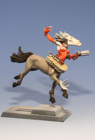
Today's picture - even more brighter, but as I said I will tone down the orange later.
Last edited:
Garshnak
New member
I am using Some mixed paints from about 10 years ago. But I am trying new things on this model since I want the red somewhat brigther than my usual red.
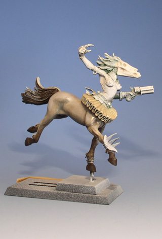
Well, y'know brightness is most powerful by contrast.
 And note, a warm red (with orange instead of white/magenta) is more often perceived as 'bright' by contrast. Because of the higher cumulative wavelength (iirc..) and by environmental contrast (dominant blue environments being most common, thus more contrasting to reds and oranges)
That suggestion of using purple is an interesting idea, that I might try at some point. For now, I believe the trick will be to go back in using Scab Red glazes and adding black for the darker shading. I am sure that the red will go a little down in intensity when mere of the model gets done...
I actually tried the bright purple today (warlock purple), it makes for a good deep red IMO. Especially when the purple painted 90% translucent over white, and then the red goes over that. Finalising it with a black+magenta(like scab red) wash to shade it.
Last edited:
noneedforaname
New member
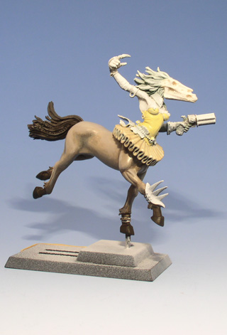
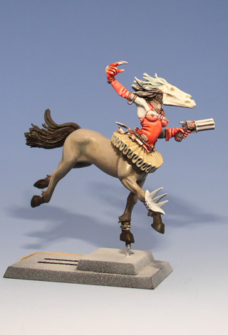
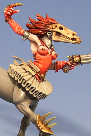
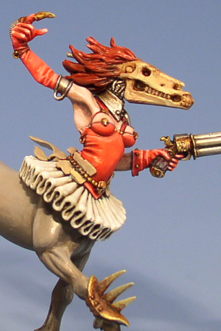
I feel terrible making criticisms about the work of someone a lot more skilled than me but, to me it feels like the model has been cut in half by the red colour and could use some red as a spot colour at the tail end to tie the two halves together. The tutu plus the big colour change seem to accentuate the fact its two separate models rather than ome coherent whole. Hope that makes sense and is useful otherwise feel free to ignore me you won't hurt my feelings.
you won't hurt my feelings.I feel terrible making criticisms about the work of someone a lot more skilled than me but, to me it feels like the model has been cut in half by the red colour and could use some red as a spot colour at the tail end to tie the two halves together. The tutu plus the big colour change seem to accentuate the fact its two separate models rather than ome coherent whole. Hope that makes sense and is useful otherwise feel free to ignore me
Makes perfectly sence. And thanks. I have some plans to tie the two halves together. Mainly the hair and tail which works alright with the colours in the drawing, but as a miniature I think it need to be brightened up. Especially since the edges on my display base will be gloss black. So the hair/tail will be a ghostly white which I should think suits the model fine. Also, removing the red from the hair will make the torso work better by itself I hope.
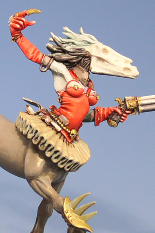
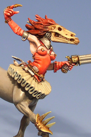
Oh almost forgot, today's update - a close-up on the torso:
GraveRisen
New member
This is so delightfully creepy, I love it awesome work so far, can't wait to see it done
awesome work so far, can't wait to see it done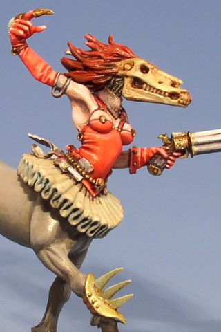
noneedforaname
New member
Your such a tease not showing the other side
MightyChad
New member
You know, the house next to mine is for sale. Maybe you should buy it, so you can come to our weekly painting group... I'm just saying! That is awesome, the red is crazy! I am loving it all, this is the first thread I go to everyday. I am sure you are tired of hearing this, but thanks for posting this WIP.
