Female Vampire

mattsterbenz

New member
Hi folks!

I figured my gallery could use an update. All I\'ve been submitting recently is commissions.

Here\'s a fun little project.

img489132e7918ee.jpg


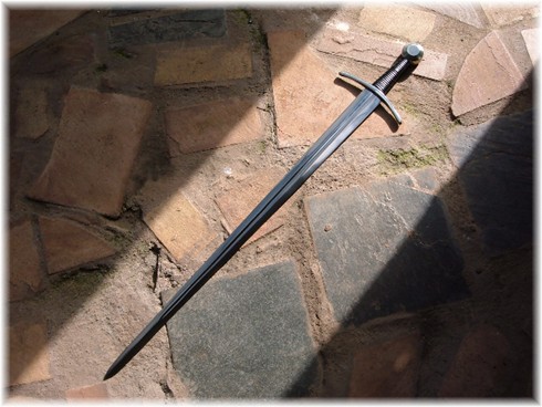
I tried painting some reflections in the NMM. The most obvious being the reflection of the flowers in the blade. You can also see some more subtle reflections like the hand on the inside of the sword handle, and on the daggers.

This was also an experiment in painting fabric textures. The blue fabric is a horizontal pattern, and the tan fabric is a diagonal-cross pattern. I painted the gold trim to resemble embroidery.

I also painted some highlights around her necklace to look like light is actually shining through the gem.

You can vote here if you would like to. :)

Thanks for looking!

-Matt
 

Aliengod3

Active member
Excellent job! I like the reflection off the sword that is a nice touch.

Also how dilute was your paint when you did the freehand-like details?
 

mattsterbenz

New member
Cheers for the comments guys :)

I thinned the paint maybe 1:1 or 1:2 paint:water. It needs to be thinned a little but not so much that it flows all over the place.

For everything but the freehand my paints were thinned maybe 1:10 paint:water or even thinner than that.

-Matt
 

redarmy27

New member
Holy crap, Matt! Nice!

I love the dress\'s colors. It looks exactly how that fabric should look and it holds that \"shine\" to it. Very nice.

Cheers,
Jake:beer:
 

Manus

New member
As much as I don\'t really like these new GW wamps I must say you have done a superp job on this one. That detail with the reflections on the NMM is just so brilliant - and her dress...man that looks real, expensive, old and cryptlike.
Very well done
 

generulpoleaxe

New member
it\'s a very nice job mate, a few points tho that could improve it.

the light effect from the gem stone would cause a stronger shadow on the opposite side of the bust (also enhancing the effect)
the sword should be lighter as it would represent a polished surface far better for the very nice effect you added (check out kyril\'s stuff mate and you will see what i mean)
even tho gold retains it\'s colour when it shines brightley nmm still needs the tiny glare spots in white for it too work (look at razzas and kryils minis and you will see what i mean)

lastly, the upper part of the eye sockets is darker on most creatures, this would also help to bring the eyes out a lot more as well as it would create a dark area near them helping bring focus to the face.

i know it\'s lots of picky stuff but hope it helps :)
 

mattsterbenz

New member
Thanks for all the comments :)

I really appreciate all that you wrote generulpoleaxe. I like it when people get picky on me! Only way to get better. :D

I\'ll definitely do those things you suggested. As far as the sword goes though I was trying to get the effect of one light source and reflected light only. When polished metal is only lit by one light source (in this case probably the moon) spots tend to be very dark and others very light. Sort of like this pic:

Windlass-European-Sword-FullPic.jpg

But I do understand where you\'re coming from.

Cheers!
-Matt
 

Wren

Member
I would love to see close-ups of the fabric textures, they are very cool! The reflected effects are also pretty nifty. Very detailed and precise work on this!
 

Avelorn

Sven Jonsson
I think this is great! The best paintjob I\'ve seen on the model and a lot of things to appreciate. I will try something similar in that I will do miniscule freehand on my next miniature so it is great to see something inspring like this.

Nitpicks. The highlight on the middle of the sword doesn\'t make sense for me. As a reflective highlight from the headpiece it would only be on the downer edge as one from an external lightsource it would be on the upper. The skin doesn\'t seem to capture the light and mood of the piece as well as the rest. You have a broad light spectrum on all other areas. Mainly I would do some darker shading on some spots. Of course it should occupy large spaces as you want the brightness of the skin to still be there. For the gold NMM.. it\'s often helpful to think a bit gem-like. One sharp highlight from above and one softer reflected ground highlight.

A 9... but you\'re not far from a 10 for me! :) Great atmosphere and mood.
 

demonherald

New member
I\'ll echo what Avelorn said there... particularly regards the skin not carrying the ame effect as the flesh but this is definitely a great job on an absolutely shite model..

silk purse from a sows ear ,, or silk dress from a sows ear.. either way another great piece from you.. The reflection part of the sword is spot on...
 

mattsterbenz

New member
Thanks guys. :)

I agree with you guys. I don\'t like that highlight in the middle of the sword either, I\'ll be getting rid of it. It wasn\'t meant as a reflection of the head piece but just meant to add interest. It doesn\'t make much sense though, you\'re right.

I\'ll be darkening the shadows on the skin. I wanted it really really pale and was afraid to have too dark of shadows lol but now that I\'ve gotten some feedback I\'m more comfortable with adding in more shadows.

Thanks for the advice on the gold. NMM is not one of my specialties. I can always use more practice :)

-Matt

EDIT: Forgot to mention that ironically I actually like this model. :D Everything is sculpted very clean and really cool. The one thing that I don\'t like (and I absolutely HATE) about this sculpt is the face. It is awful! lol
 

GobboTeef

New member
That\'s by far the best paintjob on this model, that I\'ve seen at least. The fabric is so detailed! The NMM and the gems are looking mighty fine too and I can see what you mean about the face!!

Nice one!! :D
 

RuneBrush

New member
Your paint job is fantastic, agree about the model though, great other than the face that just seems naff.

How did you go about painting the armour? I\'ve been messing around with the new Vlad model and the armour has just ended up coming out black with grey highlights :p

Pete
 

Theomar Pius

New member
Love the reflection of the head in the sword, that\'s an easy detail to overlook.
Nice job there.
I normally don\'t go for vampire sculpts, because the teeth bug me, but you really brought this one to life (unlife?)
 

mattsterbenz

New member
Thanks for all the kind words guys :)

RuneBrush, sometimes that happens with NMM to me too. Don\'t start with black, but more of a mid-tone and shade/highlight from there.

I basecoated it with a mix of Codex Grey, along with a touch of Liche Purple and Chaos Black. Shading was done by adding in another mix of Chaos Black and a touch of Liche Purple. Highlighted up with Codex Grey, and then added Elf Grey for further highlights, followed by Skull White on its own.

I have a couple welled palettes that I mix my colors in, and I add lots of water to ensure thin layers. The welled palette keeps colors separated and prevents them from spreading, as opposed to a wet palette. Plus they stay wet nearly as long.

Theomar, I agree with you about vampire figures. I really dislike the teeth on most of them. They look like saber tooth tigers! lol

Thanks again all!

-Matt
 
Back To Top
Top