Kingdom Death Man Hunter WIP

ScottRadom

Shogun of Saskatchewan
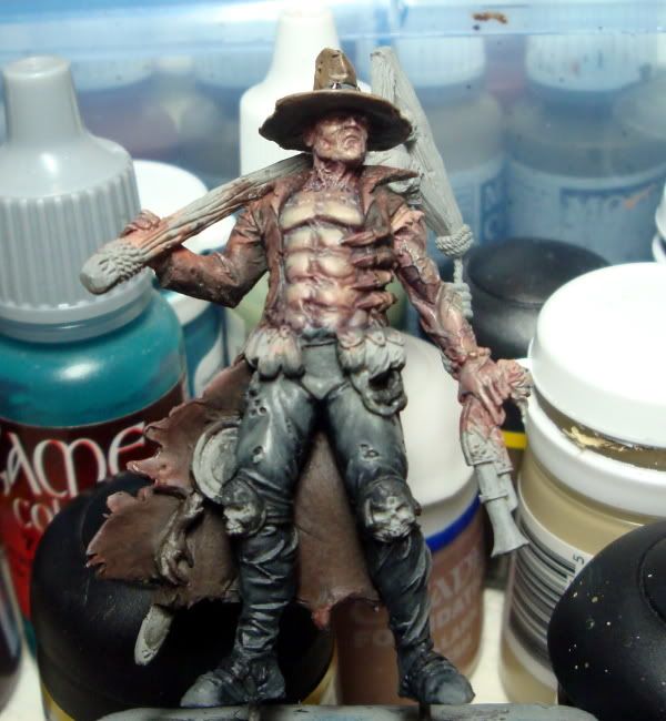
Okay, this is my first attempt in adding more shadow in a mini and highlighting less and shading more further down the mini. Here's what I got....
WIPS002-3.jpg

I'm using Vallejo Green Grey (or is it Grey Green? I can't remember. the greener one) with about 1:1 black as a base. Then I added more and more black to the mix, shading the hell out of it in the shadow along the inside and outside legs as well as at the base of the legs. Highlighting was done only up to about the mid tone on the bottom half, and up to about 1:1 Green Grey and VMC Buff at the top. Several times during the process I felt the need to glaze with a little diluted GW Black wash to help with the blends and such. A little bit of pure buff was added along the folds and holes in the pants as well. So... too much? Not enough? Thoughts?

I'm not done with the skin for sure, I just need to get more of the rest of the model worked on so I can get a better idea of the skin colours and how they'll go with the rest I think.
 

GreenOne

I paint my thumb.
Nice pants there mister...
Seriously tough, If you provide us with bigger pics the C&C process would be more efficient.
 

ScottRadom

Shogun of Saskatchewan
All right, moved on to the jacket to help try and get a better idea where I am going with this mini. I wanted it to be a brown with a reddish look to help differentiate the flesh, which is going to have more blue and purple added. Not done of course on the jacket, but here it is. Basecoated with Cam Black brown. I think that was a mistake and I should have started with a scorched brown maybe. I did the shading with a green, VMC USA Olive Drab which is pretty black green. That's a first for me, and I just wanted to try it out. I like it! I think I'll use that again a bunch. Anyone have any thoughts about the color choices for the jacket, or anything else?
WIPS001-1.jpg

WIPS002-4.jpg

The pics show that the work on the left calk muscle is pretty rough. That goes on the to fix list. The check list of stuff for sure I need to do...
-More shading/color on the flesh. Pushing towards cool colors. Right?
-Fix up the pants some, esp. the groin and calf.
-More highlights to the hat.
Any opinion on color for the scabbard?
Any thoughts and crits appreciated. Thanks!
 

Tagamoga

New member
Hello ScottRadom,

Real nice work on this cape. But I am afraid, that the color is to near related to the skin. So is does not raise enough from the skin. But I hope it becomes better, when all the tiny details are painted.

Greetings, Taggi
 
Last edited:

Phaty

New member
Nice work so far Scott. I kinda like this mini and lurking a bit in your thread. I´m wondering about a final result, because it's turning great for me. :good:

Hello ScottRadom,

Real nice work on this cape. But I am afraid, that the color is to near related to the skin .....

Greetings, Taggi

I´m not sure Taggi, as I really respect your color feeling and even if your probably right about close related colors .... but I like that color scheme Scott picked and it really works for me - related to miniature itself. Probably just a question of personal taste anyway. No offence ofc.
 

BPI

New member
Hi Scott, I like his trousers, nice sense of leather to them with the painted in shine & the gradient to dark around the ankles from light at the waist works for me. That rough patch on his calf demonstrates how nicely painted the front is :) The coat has a nice bloody sense to it & with both it & the skin not yet complete there's plenty of time to keep them tonally (?) distinct (as you've mentioned already).

Scabbard colour? Repetition of hat colour I suppose. So as not to fall into my old bugbear trap I think you need to jot out a plan for the rest of your colour scheme though. I have many figures where I've just kept adding another one in & they end up looking like rainbows :D Pouches, ropes, wood, metals, there's so much going on with this guy that mapping out ideas now may help prevent frustration down the line. Is that a rope or intestines hanging under those pouches?

Shoes: are you leaving them black? I'd be tempted to distinguish them from the trousers.

His left shoulder: doesn't the coat come down over the next section of the sculpt? Caught my eye on the rear shot. It'd make it look as though the sleeve had been ripped rather than cut off & save you the hassle of painting in the wound/fungal infection that would otherwise be causing that bumpy growth :)

Keep up the good work :good:

Cheers, B.
 

Tagamoga

New member
Dear Phaty and ScottRadom,

sure EVERY comment of mine is personal taste. Sorry to sound as if have got the absolut truth. That i did not want to intend. In my opinion every comment or advice is only a purpose, that every painter my refuse or not.

I like this mini, though my critism! It is only a point I wanted to mention. Perhaps the painter may tink the same...

Greetings, Taggi
 

ScottRadom

Shogun of Saskatchewan
Oh, no Tagamoga, never be afraid to voice any crit or anything on any mini in a WIP thread, esp mine. And I do actually agree with you on the sameness of the skin and the coat with both leaning towards the red. I intend to go back to the flesh with a healthy amount of blue and green and purple. Especially in the shading and at the point where the skin meets the jacket. Hopefuly that breaks it up enough!

Thanks for looking you guys!
 

GreenOne

I paint my thumb.
I like the coat's color, in line with the broody feel of the mini. May I suggest more highlights on it? The top of the back could be a couple gradients lighter than the rest, and some starker highlights, toward gray, on the edges and sich, would give it a nice leathery feel ( Same as the pants. Pants have more variation in light on a smaller surface, coat would need as much.
Skin doesn't need that much color actually, and beware not to make it too cold, it more strategically places shading that's needed, under the lower abs, arms and such. Shading would go *dark* in the lining of the coat, but not really *cold*, purple is complementary to the red, green is opposed, thus cooler, they both serve different purpose here, darklining would be more towards brown/black. Hope this all make sense to you, what I have in my head is a big color soup ;)

Scabbard I think should be kept simple, in the line of the pants, to better install that color on the back view, darker at the bottom of the mini, and lighter at the top, think automaton :)
 

Phaty

New member
ashamed

@Taggi - Sorry, ... feel a bid sad about your reaction. I really didn't mean that offensive, so please take my apologize if it sounds like that.

And ...sorry Scott for that unwanted flame I started in your thread.
 

Tagamoga

New member
Hello Phaty,

i have answerd your PM already. Please ScottRandom forgive me, to response here. But I did not felt offended by Phaty, or thought about a "flame". I only recognized, that my answer could be understood as if I thought of myself beeing the best of you, within all wisdom about painting. I only wanted to make clear, that it is not so and that I have to learn very very much.

So my hints a realy only a purpose. Because of that I have already changed my signature. I have no good english, and I hoped to explain, that it is not the "final" hint, but only a proposal. I am sorry, that my reply sounded touchy. This was not to intend. Nobody has offended me, so there is no reason, that I could be touchy.

So I please you to take this realy only as a misunderstood, not a sulky answer.

BTW:

The Idea of a coat of green/blue/violet for the skin is in my opinion a really great Idea.

Greetings Taggi.
 
Last edited:

SkelettetS

New member
actually, arent you guys really making a hen of a feather here? wip threads is all about getting criticism (good or bad) and to get opinions. personally, i think i wait a few updates until i hit with my crit, maximum damage lol.

i think you (scott, that is) should try to push the highlightning more, this mini is drama! like the pants, good job there! really cool mini, too bad its sold out...
 

freakinacage

Well-known member
ohhh listen to you lot. offence my arse. scott, your painting's crap! thats how you offend someone! so there...
 

GreenOne

I paint my thumb.
''I comment because I care''
LOL

I guess the lots of people that hate Scott's guts just don't bother giving opinions anyway..
They got to http://Scottmustdie.com

On a side note, I always felt the ''no offense intended'' line makes the comment more offending... reads as ''There's something to be offended about; but I didn't mean it... or did I''

Just fooling around... no offense intended, of course :p
 

ScottRadom

Shogun of Saskatchewan
WIPS003.jpg

WIPS006.jpg

Did more highlighting in the jacket, I think it's abotu where I want it to be. Also added a bunch of color, or tried to, to the skin. I'll likely have to go back and put in some more highlights. Is the jacket color still too close to the skin? Do I need more blue, green, purple or whatever in the skin?

GreenOne- I am using photocuket and getting bigger pics is not possible. Sigh....
 

Prophecy07

New member
He's got a definite Freddy thing going on there. That's not a bad thing (well...unless you live on Elm Street, I guess). Nice job, Scott.
 

GreenOne

I paint my thumb.
I use Photobucket as well, and it doesn't shrink the pics in wip. If you just crop it closer to the subject, it's already a lot better.

Skin is more interesting already, I don't think it needs more color, but it looks like it lost some shading in the process.
Jacket looks quite good now.
 

mickc22

Granddad!
if you don't want your pics shrunk ya gotta pay up! :wink:
seriously tho, there should be an option for the picture size, below the uploading area I think, you can select various sizes, 1mb, 2mb, etc, etc, unless that is just 'cause I pay :smile-big:

I like what you've done so far Scott, try taking your pics with a piece of plain paper behind the mini rather than all that busy background
 
Back To Top
Top