freakinacage
Well-known member
trousers look good but that arm looks light a right nightmare to paint with all those veins. don't envy you. am surprised that you let them use your likeness for the torso sculpt though, i know how private you are...
trousers look good but that arm looks light a right nightmare to paint with all those veins. don't envy you. am surprised that you let them use your likeness for the torso sculpt though, i know how private you are...
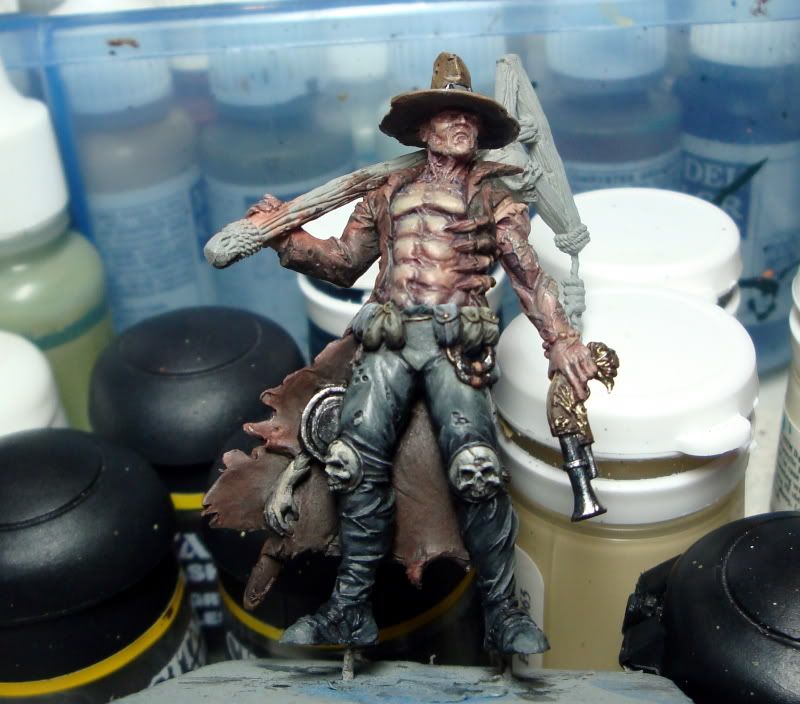

Yes.I decided that even at the risk of having the model all blend in together I'd rather see him look more like the horror movie villain in worn out old dusty style clothes and tuff than go with some colors that might've popped more. Any thoughts on that?
-Green in the shadows. Good eye DR/Mike on the pants, Green/grey is the color I am using with the black for the leather color. I have added some green to the shadows, US Olive Drab as well as straight black. What kind of green do you reccomend?
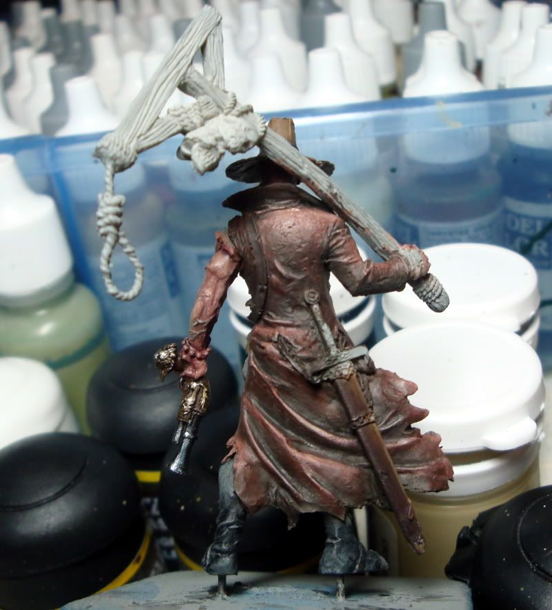
 but looked for long enough to be really bugged by the splotchy black effect shoved over his shoulder & the background
 -In this shot the thing wrapped around it's torso has had zero work! My thought was well used wooden stakes. Currently it's just the same color as the flesh and the coat as I am a sloppy painter.


Okay.... less than ideal lighting in the over the shoulder shot for sure....
The black gem effect does NOT work in that shot!
Ok try re-painting all them black and use a single line of Space Wolf Grey on the lower portion then white spot on the upper surface. Less is more for shiney black.
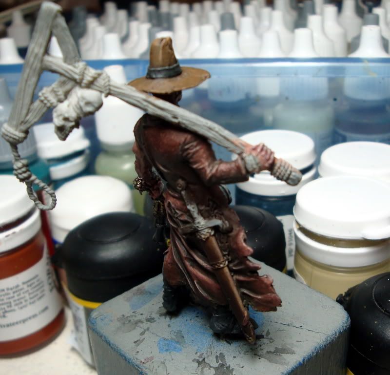
I think much more shading for the under parts fo the wood on the gallows.
I agree with you on that, but give the grain a dilute wash of something like VMC German Camoflage Black Brown to emphasize it. Also older untreated wood goes a silvery grey, so you could use that on the leading edges of the "gallows" to show age.
How's the severed hand now?
Looking a little better but I think it could go a tiny touch lighter/yellower. Just my opinion though.
Are the lasso things by the belt an improvement?
Oh Yes
Anything else?
Yep the Sword scabbard, don't know if it's deliberate or accidental but the tonality of the brown is spot on to me.
