Looking for feedback - Gandalf w/ OSL

Tinweasel

Member
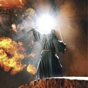
I\'m looking for feedback on my Gandalf at the Bridge of Khazad Dum figure:
161950

I\'m currently working on a scenic display bridge base for him and ideally would like to enter him in the upcoming Golden Demon competition in Chicago. I\'d really like feedback given what does and doesn\'t work about the figure.

img468074e472bff.jpg

This is a piece I painted up specifically for the Citadel Celebration Lord of the Rings painting competition at the prompting of my local GW Hobby Store manager. It\'s the first time I\'ve ever gone all out with object source lighting effects, and I\'m actually trying to portray two light sources on the figure.

The first effect is a bright white light from the crystal on his staff - note: unlike most depictions I\'ve seen (even the Fellowship of the Ring film where I got my inspiration for his pose), I painted the white light as if it\'s emanating from the crystal and NOT the head of the staff itself. With the projections of wood on his staff beneath the crystal, I feel the white light should actually be blocked moreso in several places unlike what is shown (briefly) in the film and what has been done on OSL-effect Gandalf figures I\'ve seen painted thus far.

The second lighting effect is an ambient fire glow from an imaginary Balrog facing Gandalf at a distance, much like in the scene from the movie where Gandalf challenges the beast from the bridge span, raises his staff alight, and shouts \"You shall not pass!\"

All the metal areas on the figure are painted with GW metallic colors and added tints to match the expected lighting.

Thanks!
 

fildunn

New member
nice figure, it might help if you stick the picture in this forum. saves peaple having to flick back and forth.

overall its very nice but i see two things i would change.

1. you have to bear in mind the intensity of the light source and this doesnt show on the Balrog OSL compared to the staff OSL. eg the balrog is on fire but is further away so should be orange/yellow, suptle and diffussed light on the front of Gandalf. whilst the white light should be more intense and localised and out-shine the Balrog\'s fire glow.

2. its also a good indication of success if you hold your figure at arms length rather than close up. this way you can check out whether you\'ve got the contrast right on the figure as a hole.

my advise would be to 1, differentiate the two light sources and 2, turn up the contrast quite a bit. both these things will help with a figure with OSL being such the focus. all in all the figure is very well painted

just my two cents geezer :)
 

Tinweasel

Member
@ Fildunn - I edited the first post with the image and the description. Good idea, and thanks for the feedback! So far as the contrast between the two colors of lighting, this is what\'s going to kill me in the ratings (and likely any Demon judging). Because I\'m a stickler for detail, I went through that particular scene in the film frame by frame and took a few photos with my digital camera for color references and such - the brightness IMO is pretty much spot on in both instances... he\'s fairly washed out from both light sources equally. (The staff is bright, but just a single source and one-directional. The orange flame is more ambient, but it\'s coming from a massive, shifting source I\'m guesstimating about 30 ft. away, if not less. Six of one, half dozen of the other...)

Some reference pictures I used:
gandalf_at_bridge1.jpg

gandalf_at_bridge2.jpg


The first one is him holding the staff up as it\'s still lit fairly bright, right before the Balrog steps onto the bridge and swings his sword at Gandalf. His face and affected clothing as lit by the staff in the movie pretty much have all the details of his face and the like washed out except for hints of his eyes and open mouth - areas of obvious shadow... I did want to have the effect of his eyes glowing when he was using his magic to ward the bridge, as the scene cuts to a back view with his staff alight before it cuts back to the first face closeup I just posted.

As for the 2nd pic, that\'s after the Balrog has swung its sword and broke it on Gandalf\'s staff and sword, but before Gandalf slams his weapons together and then pounds the heel of his staff on the bridge. His staff isn\'t really lit much, but I figgered this 2nd one is a good reference pic primarily for the color of the Balrog\'s flames on his clothing and such - again, mostly everything\'s washed out but this time with an orange tinge.

If anything, I\'m thinking I probably ought to add a little more orange to the extreme forwards edges of his belt and scabbard strapping - as it is, they undergo a pretty significant color change: from blue to grey with an orange tint and leather brown to an overall browny-beige. For the orange, I was using GW Hobgoblin Orange, which is a perfect color for firelight...

So far as the actual lighting effect I was aiming for, these two pics together give a pretty good idea of the intended lighting - except I\'ve got the light from the crystal blocked by interference instead of radiating in a \"globe\" or \"lens flare\" effect from the entire head of the staff.
gw_gandalf_back.jpg

lit_staff_gandalf.jpg


I don\'t know if any of this changes your suggestion to make the contrast between the two light sources as shown on his figure a bit more stark/deliberate - assuming I\'m understanding you correctly - but if so or if not, please respond either way?


@ uberdark - I\'ll work on getting a dark background. I\'ve got a single picture that has a dark background from when my wife and daughter were up on vacation and still had our digital camera with them and (horror of horrors!) I was \"reduced\" to using our scanner to capture images.

For example:
gw_gandalf_right2.jpg
 

Fists of mortis

New member
Nicely painted, you should do well in GD.

Where is the source lighting by the way? The skin doesn\'t look illuminated and the white on the floor and cloak looked like snow to me ???
 

Ogrebane

Active member
I would have thought that the top of his knee and the top of his belt shold be bright as well. Still a very nice piece very emotive. Did the vote thing. GL
 

Tinweasel

Member
@ Fists of mortis - There\'s two light sources, actually. One is the crystal at the top of his staff, the other (if this were a full diorama) would be a massive, flame-lit Balrog that Gandalf is facing towards on the opposite side of the bridge from where he stands.

I think the base does a better job of showing the light sources than I could explain. Where the orange fire glow from the Balrog in front is blocked completely, there\'s a dark shadow cast behind Gandalf and darker shading on his back side; the bright white light from his staff crystal is blocked completely by the projections on the staff underneath as well as by Gandalf himself, hence the unlit white areas in an arc on the base and across Gandalf\'s midsection (note the shadows beneath the rock on the base cast by the white light).


@ Ogrebane - I\'d agree with you about the knee generally, but on this figure the knee is actually further back than the hem of his robes and looking down from the perspective of the crystal, his robes wouldn\'t be white-lit until slightly below his knee. So far as the belt(s), it\'s blocked completely from line of sight from the crystal by Gandalf\'s staff, but I would agree that it ought to be more orange-tinged from the Balrog\'s light and have more defined edge highlights.

Which brings me to...
I took some pictures with a black background. I also darkened the back of his sword hand a bit, tinted his staff hand a bit more orange, tidied up his face a bit, and made the belt and scabbard straps on his front a bit more orange-tinged with a bit more edge highlighting - the stuff that just seemed kinda off to me compared to the rest of the figure. (His eyes and facial non-paleness have always bothered me, especially from the front view. I\'m happier now!)

gw_gandalf_face3.jpg

gw_gandalf_right3.jpg

gw_gandalf_back3.jpg

gw_gandalf_left3.jpg

gw_gandalf_top3.jpg


I got rid of the alternate front view compared to the current set. It\'s kinda redundant, methinks, as all it really did was show off the edge highlights and white metallics of the sword a bit more.

Does the black background make any difference appearance-wise?
 

Tinweasel

Member
So what do people think of the black background photos and the tidied-up details? If it\'s an improvement, I\'ll likely post this set up in my Gallery.
 

Bill

New member
I think that last set of photos is pretty much spot-on! Maybe could still use a bit more shadow at the back, more contrast to make the OSL pop, but the rest is damn near perfect.

PS. Post that Orcus in your gallery! Now! :D
 

Tinweasel

Member
An update of sorts - this figure won the Silver award at the Chicago Golden Demon competition in the Lord of the Rings Single Miniature category. It goes without saying that there were a lot of solid entries and it shocked the hell out of me that I won an award at my first time attending a Golden Demon event, much less making first cut with all my other entries.

Here\'s Gandalf on the custom display base bridge with painted lighting effects itself to match the figure:
http://www.coolminiornot.com/165288

Here\'s pictures of Gandalf with a dark photo background similar to the pictures posted earlier in the thread:
http://www.coolminiornot.com/164731

Many thanks for the support and feedback from everyone, and I am amazed by the togetherness of the community around here - I wish I could\'ve met and chatted with some of you folks there (as apparently quite a few of us were even in the same general vicinity and didn\'t even know it!)


I\'d really appreciate feedback and comments on the overall appearance of both the figure and the bridge, as I\'m currently in the (slow) process of converting and painting a Balrog with OSL to stand opposite Gandalf on a separate cliff piece - the bridge and Gandalf are painted to take the now-missing Balrog into account.


P.S. - Orcus is next on the list to be completely finished now that my Demon entries are out of the way, short of finishing a quick squad of Necrons so I can actually play 40K some time in the next decade...
 
M

Malfoy

Guest
I concur- a well-deserved win in a tough category to be sure.

I think I like your figure better off the display base. It\'s more subtle.

I also think the trick with the LotR figures is to get the eyes just right, which I think you did.

Grey tones also came out nice.

But all this is academic- you got a frick\'in Demon my friend!

Dave
 

Bill

New member
Congratulations man, I knew you\'d get something! :D Superb work. I\'m sure this won\'t be the last demon you win.
 

Tinweasel

Member
Any chance I could get some critique of the figures posted here and here. Granted, it\'s all new to me what with having a Demon-winning figure and all, but I\'d have expected that with folks seeing it in person and having exposure elsewhere (like the GW website, etc.) that scoring might have gone up instead of down.

I guess I\'m taking it to mean that the figure\'s not dynamic enough appearance-wise, or the colors are off... or something? Bad pictures, maybe?


Seeing as how I won a Demon for him, I\'m currently considering him my best piece thus far, and if he really, truly only rates in the low 7\'s, I\'m wondering where I need to improve. (Granted, I intentionally painted him in washed-out, oversaturated colors, but still...)

Am I getting a little too hung up on the whole scoring thing? It\'s not like I\'m really getting any comments on the entries themselves...

Also, I\'m currently working on a GW Sharkey (AKA Saruman) figure in a somewhat different style and I\'d really appreciate feedback on my Gandalf figure for the sake of contrast - I\'m painting up Sharkey as kinda the \"anti-Gandalf.\"
 

AinuLainour

New member
I agree with Malfoy that the display base is overkill - it\'s a nice mini but with a base like that, there\'d have to be a Balrog on one end to justify it\'s size.

The lighting could be a little more subtle, it doesn\'t blend as well as it could (see base). Aside from that, I like it. :)
 
Back To Top
Top