You are using an out of date browser. It may not display this or other websites correctly.
You should upgrade or use an alternative browser.
You should upgrade or use an alternative browser.
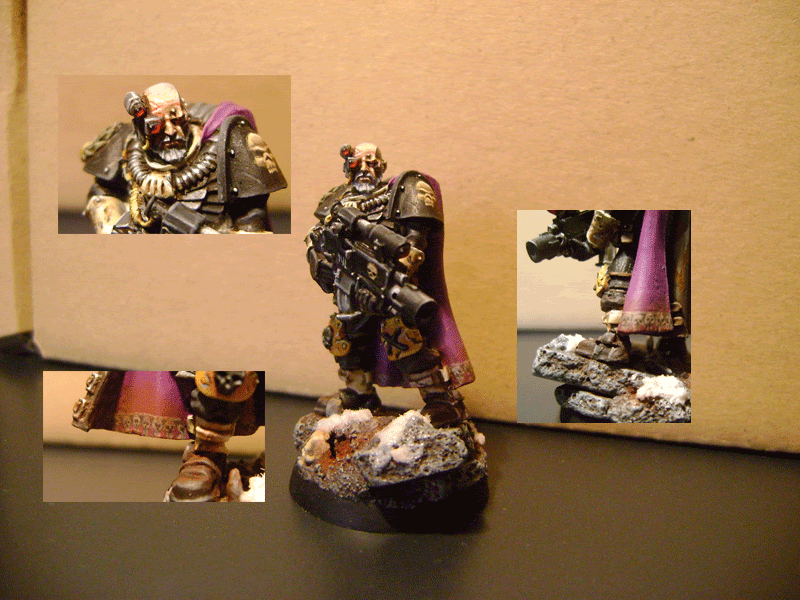
Mortifactor Telion
- Thread starter phreak0
- Start date
Photos aren\'t great, but I certainly wouldn\'t say you\'re lacking. You seem to have a fairly good technique all over (nothing sticks out as being poor, IMO... except for the photos... ") ), but there\'s definitely room for improvement all over, as well. It is difficult to give you any detailed pointers with such fuzzy pictures, so maybe that\'s what you should try to improve first? There\'s lots of useful information in the photography section here.
), but there\'s definitely room for improvement all over, as well. It is difficult to give you any detailed pointers with such fuzzy pictures, so maybe that\'s what you should try to improve first? There\'s lots of useful information in the photography section here.
), but there\'s definitely room for improvement all over, as well. It is difficult to give you any detailed pointers with such fuzzy pictures, so maybe that\'s what you should try to improve first? There\'s lots of useful information in the photography section here.green stuff
Active member
I\'ll second Anders\' words.
Colorwise, I like how you desaturated the purple; I think it works rather well for a Mortificator now that I see it.
Photowise, I think a simple front and back collage with a detail shot on his left shoulder would work better than the layout you show here.
What kind of camera are you using? There seems to be quite a bit of noise on the cape.
generulpoleaxe
New member
yeh man, the tools are their alright, they just need refining.
practice mate, that\'s all you need.
you are better than what you give yourself credit for.
read space monkies photography guide, it will help as good pics allow others to realy see what your minis are like.
practice mate, that\'s all you need.
you are better than what you give yourself credit for.
read space monkies photography guide, it will help as good pics allow others to realy see what your minis are like.
Einion
New member
I\'ll third Ritual\'s assessment. I think this is more than decent work, shows a good feel for the subject, ambition and developing skill. Just practice more - go for refinement, subtlety, more drama (increased contrast).
On the photos front, in addition to focussing more carefully (as well as using a smaller aperture if you can) I\'d definitely work on the lighting setup - abundant indirect (diffused) lighting is what you want ideally.
Einion
On the photos front, in addition to focussing more carefully (as well as using a smaller aperture if you can) I\'d definitely work on the lighting setup - abundant indirect (diffused) lighting is what you want ideally.
Einion
Bignastyshark
New member
Great mini mate,
I love the free hand on the shoulder and the tiny skulls on the trim of the cape,
I agree with all the sentiments already laid down,
Its not the painting is the photo,
Cheers,
Iain.
I love the free hand on the shoulder and the tiny skulls on the trim of the cape,
I agree with all the sentiments already laid down,
Its not the painting is the photo,
Cheers,
Iain.
Joek
New member
The photo you\'ve posted here is not too bad, but CMON has done that nasty shrinking thing with the one you\'ve submitted - it\'s definitely harming the score, as it\'s a really nice figure!
The only thing I\'ll say is to keep in mind the 600pixel width - as long as you keep to that width, you can actually go down as much as you want. Took me ages to work it out correctly
The only thing I\'ll say is to keep in mind the 600pixel width - as long as you keep to that width, you can actually go down as much as you want. Took me ages to work it out correctly
BPI
New member
Hi phreak0, I hope you don\'t mind but further to Joek\'s advice here\'s a quick tweak of your photo montage. Not that I\'m a computer whizz, just giddy at finding a function in a bit of software that works for me! (Irfanview, Image drop down menu, Create Panorama Image). It\'s 203x928 and 174kb, so you\'ve loads of room to spread out to the gallery\'s 600 pixel width should you want to use higher resolution/less compressed pictures (I\'m still trying to work that one out myself!).
May I also second the compliment on the skulls, especially around the cloak base, very nice indeed.

If you\'d rather I hadn\'t interfered please post here & I\'ll delete the image
B.
May I also second the compliment on the skulls, especially around the cloak base, very nice indeed.
If you\'d rather I hadn\'t interfered please post here & I\'ll delete the image
B.
cleen X
New member
Very nice You could check out this article about taking photos: http://www.coolminiornot.com/article/aid/101
And this one about photo manipulating in GIMP : http://www.coolminiornot.com/article/aid/724
Hopefully you will find these two useful, they really helped me take better photos!
You could check out this article about taking photos: http://www.coolminiornot.com/article/aid/101And this one about photo manipulating in GIMP
: http://www.coolminiornot.com/article/aid/724Hopefully you will find these two useful, they really helped me take better photos!
