New OSL thread!

lizcam

New member
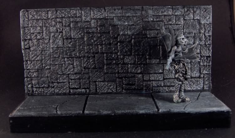
Having PM\'d ShawnRL because I couldn\'t find that monster OSL thread from the distant past I am now starting a new OSL thread at his request. I will be posting some pics in it tonight to ask him for help on something. THANKS SHAWN!

Anyway, if you have any questions for him just post them here and we\'ll create a whole new monster thread! Let the beast live!

Edit: Moved this here becasue it seems more logical than painting and conversion.
 

lizcam

New member
Ok, it\'s crap right now but then that\'s why I\'m posting it here for Shawn to help me. Here\'s what I\'m working on

3-28-08001.jpg


Everything on the mini from the waist down has not been touched. The wall is a mess and I hate this mini with a passion but I started it and I\'m going to finish it, dammit!

The light scource is off scene to the lower right and don\'t ask me what it is because I have no idea. The whole thing is being painted in grey scale so it actually is grey. I didn\'t forget to enhance the colors. There will be bright red blood on it a la Sin City when it\'s done and a barrel of oozing body parts to the left. It going to be called \"Now I\'m Alone in the Dark\" as the theme of the comp it\'s for is \"Alone in the Dark\".

All I can say at this point is HELP!
 

lizcam

New member
Originally posted by freakinacage
looks great so far. got any closeups? looks really smooth too

Not anything recent. I\'ll get some some time today. I like the floor for the most part and the upper body of the mini is fine but the shadow on the wall needs some real help. This is my first osl and I might be bitint off more than I can chew doing it in grey scale. It\'s hard to convey the mood I want when I\'m not using colors but I figured it would be a good excersize for me and in the end I think it will look really cool. If I can get OSL down doing this, doing osl in color should be no sweat!
 

lizcam

New member
Originally posted by Dragonsreach
This any help


3-28-08001.jpg

Actually It does. I had it looking like that at one point but I thought it was too dark so I lightened it up. Lets see if I can find that photo........

3-29-08001thewall.jpg


Actually what I did was darken the left side of the wall and then go back and re-grout things. I think I got carried away.
 

DaN

New member
I THINK what looks wrong with your darker version Liz is that it seems to bend as it goes up the wall - the angle should be kept the same...

I dunno if it\'s just the photo though...
 

lizcam

New member
Originally posted by DaN
I THINK what looks wrong with your darker version Liz is that it seems to bend as it goes up the wall - the angle should be kept the same...

I dunno if it\'s just the photo though...

Good point. And also the wall itself is kind of flat looking too. I worked on it a bit before I read this. Here\'s where we are now;

3-29-08002thewall.jpg


Dpn\'t know if it\'s any better. I\'m getting a case of the shinies from the magic wash so I\'m going to have to do a quick dullcoat and then re-photo it.
 

azcrwr

New member
Why does Dragonreach\'s take on the shadow look more like a real shadow though? I almost think that the curved, stretching left side looks ....right (as in \"real\") as opposed to the many-angled shadow on the lighter grey wall.

Just my \'umble opinion though.......

Wen
 

AinuLainour

New member
The black part is as shiny as the grey part, which instantly makes it \"unbelievable\". If you made it matte, this would change in an instant. Painting is good, but I feel this needs to be said. Sorry if I\'m coming across as harsh :~(
 

lizcam

New member
Originally posted by AinuLainour
The black part is as shiny as the grey part, which instantly makes it \"unbelievable\". If you made it matte, this would change in an instant. Painting is good, but I feel this needs to be said. Sorry if I\'m coming across as harsh :~(

Actually I had said the same thing earlier after I posted the last picture. It\'s one of the hassles of using magic wash. You get \"the shineys\".

I also noticed that the way I light it can throw a new shadow over the painted one which doesn\'t help. I haven\'t fixed the shineys yet but I did flood it with light to try and get rid of the natural shadow. Here\'s what I get


3-29-08002thewall-1.jpg
 

Dragonsreach

Super Moderator
Staff member
Originally posted by azcrwr
Why does Dragonreach\'s take on the shadow look more like a real shadow though?
I tried to emulate the Umbra/Penumbra states that occur due to proximity of the original items casting the shadow on the wall along side the fading of the shadow caused by Light leaking around the edges furthest away from the wall.

Does that make sense?..........well it did to me anyhow.
 

lizcam

New member
Ok so here it is dull coated. I was trying to do the same thing Dragonsreach was. It looks a bit better with the dull coat but I don\'t know. Tell what you all think.

damnwall002.jpg


3-28-08001.jpg
[/quote]

Looking at yours compared to mine I think I know what you mean. I need to make the farthest left edge of the wall darker and the area around the left side of the shadow lighter a bit to make it look more \"real\". Right now it\'s too .......bright? There\'s no depth to the darkness if that makes sense.

Well, it\'s 2am here so this is going to have to wait untill tomorrow. <yawn>
 

freakinacage

Well-known member
Originally posted by lizcam
Looking at yours compared to mine I think I know what you mean. I need to make the farthest left edge of the wall darker and the area around the left side of the shadow lighter a bit to make it look more \"real\". Right now it\'s too .......bright? There\'s no depth to the darkness if that makes sense.

looks good, but i agree with what you say there
 

Shawn R. L.

New member
Sorry, I totally forgot that this thread was in the WIP section (which I seldom look at). Hittin\' the hay now but will try to check in tomorrow.
 

lizcam

New member
thanks Shawn. I see a few things I need to work on already like I need to darken f=the folds of the cape in the front and the shadow is too light but I still need help. I appreciate it. :D
 

Shawn R. L.

New member
MMmm K, you have the right idea, you just need to kick it up a notch. Make the \'closer end to the light\' end of the wall a bit more light and the dark end a bit more dark. Also, what REALLY helps OSL work is to highlight EDGES (on the wall and the fig.) that are facing the light source.......here\'s and example -

http://www.coolminiornot.com/76971

Cast shadows get more diffuse the further they get away from the object casting the shadow. Blur the edges on the furthest away part to simply blend in with the wall.

Try this stuff and re-post.
 

lizcam

New member
I worked on this a bit this weekend and here is what I have. Still not sure about it. I think the dark side may need to go darker.

Clipboard01.jpg


I also think I need to highlight the bottoms of the dark side bricks a bit more. I darkened most of the shadow a bit as well. What do you all think?
 

Shawn R. L.

New member
Sorry to say this but it\'s getting further from where it needs to be. Look at the link I posted above and notice how much difference there is in both tone and color. At this point, as a learning piece, overdoing it would not be a bad thing. Make the contrast between light and dark BIG. Use the mid tones but make sure to include pure black and pure white.
 

lizcam

New member
lol and now we stray into the area of Liz\'s fear of high contrast. That\'s why this is so good for me. I always have issues with hig contrast. Ok. I\'ll take a deep breath and just do it!
 
Back To Top
Top