Scott vs. Leonidas

ScottRadom

Shogun of Saskatchewan
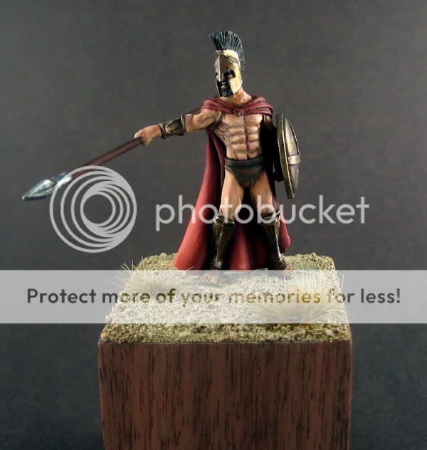
So I was practicing my skin tones. I think this is an improvement but I TOTALLY chickened out when it came time to adding blue, green and stuff. Pretty happy overall. Please let me know any areas that need improving. I felt I had better contrast on the cape. Next model will try and goof around with some of the colors suggested. Thanks for looking guys!
IMG_1496.jpg

IMG_1498.jpg

IMG_1499.jpg

http://www.coolminiornot.com/214387
 

ScottRadom

Shogun of Saskatchewan
The base is from Dragon Forge with sand and a piece of slate superglued on top, then blasted with accelerator. The tufts are silfor tufts.

Thanks for the comment!
 

supervike

Super Moderator
Yes, I\'d say in general.

You painting is very solid, and has great tone, but I think if you push the highlights up, you\'d get a much more eye poppin\' look.

For example, Ritual uses darker tones, as you do, but he really emphasizes the light as well.


img48752822d7a67.jpg


It\'s those final highlights that seem to make the piece come alive.

Of course, I\'ve no idea how to apply that, if I could, I\'d show you my own pictures! lollollol
 

Prophaniti

New member
The sheild is very nice, but it is upside-down. The \'arrow\' is actually a capital lambda for \'Lakadaimonia\', what the Spartans called their country.

Otherwise very nice, but I think the spear shaft could do with a highlight.
 

ScottRadom

Shogun of Saskatchewan
That\'s the second dude to tell me the shield was upside down! All I can say is it\'s defo not my fault, as it came attached to the arm and no way to plug that thing in the socket upside downlol

edit- you\'re right about the spear. I haven\'t sealed it so I will apply something to it.

Thanks for the example Vike. That Ritual is no hack for sure!
 

GreenOne

I paint my thumb.
Neat, I think the others are right about the highlights; the shading is a bit extreme around the abs too. Besides that, nice work, pretty smooth. Skin is one of my favorite things to paint, so much possibilities and subtleties; to get the most out of it you have to discovers the joy of color glazing ;)
And nice work on the metallics, you seem to struggle a lot less with bronze.
 

uberdark

New member
another step up for scott.... this is a great job on a mini.... pretyt much what everybody else said you need to do... so i wont rehash it...but honestly one of your better ones.

keep it up.

uber
 

ScottRadom

Shogun of Saskatchewan
Thanks guys, much appreciated. Improvement is the goal!

Next one I will TRY and take a little more time on. This was predominantly an experiment in improved skin tones and I got a HECK of a lot of good advice and suggestions. Start to finish this piece was maybe 5hrs, and I know top quality takes much more time then that.

Thanks again to all. Man the online painting community is sure tops for generosity!
 

ScottRadom

Shogun of Saskatchewan
Originally posted by starchaser1
hi scott your metalics are great all that practice has payed off realy good job man:D

Dude, can you fire me (or post here) your metal recipe again? I\'ve lost it from my notebook, and I actually wanted to try it out on this models leg greaves(??) but couldn\'t find it. Thanks amigo!
 

ScottRadom

Shogun of Saskatchewan
Thanks again guys....

About the shield. As it turns out that\'s the way the symbol is portrayed in the graphic novel, so I imagine that\'s why they were cast as such. I have no doubt that it is historically innacurate, but not my fault.

Just for revenge 2200 years from now some greek will make a model of me with the maple leaf upside down!

....c\'mon..... you don\'t think I will be immortalized in 28mm form? -sniffle-
 

mattsterbenz

New member
Looks good Scott! Like others have said, more highlights and more shading, but keep it controlled. Use the highlights sparingly and keep the dark shading only in the deepest recesses and you\'ll really polish it off.

-Matt
 

mickc22

Granddad!
good work Scott, not much point repeating what\'s already been said, coming on in leaps and bounds
I\'ve got a face/skin tut I got from somewhere you may be interested in, I\'ll try and find the website again, if not I can email it to you :D

here\'s a simple flesh recipe you might like to have a play with http://www.youtube.com/watch?v=V4PxMLuB65Y
 

Ritual

New member
I agree that you should try and go further with both shading and highlighting to up the contrast. I\'m curious to know what you use to shade the skin with. In some places I think the shadows take on a slightly weird colour...
 

ScottRadom

Shogun of Saskatchewan
Originally posted by Ritual
I agree that you should try and go further with both shading and highlighting to up the contrast. I\'m curious to know what you use to shade the skin with. In some places I think the shadows take on a slightly weird colour...

The VGC equivalent to scorched brown. Then as the consensus was it was too stark looking I glazed over top repeatedly with VMC Sunny Skintone (I think). Then I didn\'t like it as much so I re-emphasized some of the shadow with more scorced brown glazes concentrating on the lower half of the torso.

Do the shadows look wierd in color choice, application, technique, or all of them?

Thanks guys, and yeah Mick I\'d like to have a look at the flesh cocktail (not in that way!) you\'ve got going.
 
Back To Top
Top