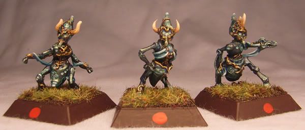
Speed-painted Akhamials

Amazon warrior

New member
Well, kind of! Fast for me anyway. And great fun.

Here they are. Please tell me they\'re better than the 2 that someone just gave them. :(:rolleyes:

Group_shot.jpg


Voting link

(I have been wondering, do the mods vote on stuff when they approve it? Cos if the mods don\'t like my stuff and vote 2s and 3s, which has been happening to me recently, I\'m rather screwed.)
 

Dragonsreach

Super Moderator
Staff member
Originally posted by Amazon warrior
I have been wondering, do the mods vote on stuff when they approve it? Cos if the mods don\'t like my stuff and vote 2s and 3s, which has been happening to me recently, I\'m rather screwed.
In the approval menu there is no voting ability. We approve mini\'s pictures not judge them.
Besides do you really think Supervike would be that evil...............(I might be, but that\'s a different story).;) :D lol

As for these definitely not a 2 or 3 but still you still need to work on a few things. I\'d suggest that the density of your paint is the first thing as the paint does look too thick in places.
Otherwise I\'m a bit stuck as to what to suggest ATM as I\'m not too sure of having seen another example on CMON.
 

Amazon warrior

New member
Originally posted by Dragonsreach
Originally posted by Amazon warrior
I have been wondering, do the mods vote on stuff when they approve it? Cos if the mods don\'t like my stuff and vote 2s and 3s, which has been happening to me recently, I\'m rather screwed.
In the approval menu there is no voting ability. We approve mini\'s pictures not judge them.
Besides do you really think Supervike would be that evil...............(I might be, but that\'s a different story).;) :D lol
Well, I was getting paranoid! lol So perhaps I\'ve aquired a sniper? A dubious honour at best, and one I think I could quite happily live without, I think. :mad:

Originally posted by DragonsreachAs for these definitely not a 2 or 3 but still you still need to work on a few things. I\'d suggest that the density of your paint is the first thing as the paint does look too thick in places.
Otherwise I\'m a bit stuck as to what to suggest ATM as I\'m not too sure of having seen another example on CMON.
Hum. You\'re not the first person to mention this. Trouble is, people say \"your paint\'s too thick\" but rarely specify where (on the model). And I do thin my paint, but trying to get very thin paint onto those tiny swirls on the armour is a nightmare! Either nothing happens, or the paint ends up everywhere but where I want it- in the recesses, all over the rest of the armour, etc. If I\'d had more time, they might be better, these were a real rush job.

Edit: For reference, these fellows are about 1\" tall. Here are the top two examples of them on CMON:
http://www.coolminiornot.com/106634
http://www.coolminiornot.com/95452

So, what am I doing wrong?
 
S

Shadzar

Guest
i will vote based on the image here rather than the gallery after i have made this post. i don\'t like the minis themselves, somethign about them in any of the image you provided jsut doesn\'t click with me. but i try not to let that affect my voting and will reserve my rating on the paintjob. as to that i thank you have done great! and i am not just ego inflating!

the stirking points for me are the horns. i like how they are done. the overall flow of the color scheme also looks good to me. its subtle but defining.

the brown base detracts from them a bit but i try to cover bases with my hand to look at the mini as though it were in it depicted environment as sometimes bases are colored for specific gaming reasons and not for display pieces. as i would guess the dots are there for as well.

i do not see this heavy paint, but thats probably because i am not one of the elites around here and have poor eyesight.

i will be voting an 8 on these, but probably not leave a comment as i have already done so here.

i think the only things that could really use some work are the background for the images, and as i said the brown bases which may or may not be somethign you can change due to gaming reasons.

i don\'t know why it would have gotten a two other than a sniper of the scuplt/manufacturer/etc because the painting looks good to me.

now off to vote 8 on it.

EDIT: i think maybe the manufacturers beveled base may be outside the norm for some people that may cause a odd voting pattern, it seems to be on all the iamges you provided links for for reference. and they are a bit tall bases. but that is no fault of your own. your basing looks miles ahead of my own so why fault you for a manufacturer faux pas.
 

Amazon warrior

New member
Thanks!

Brown seems to be my base colour of choice because I find it less harsh than black and less obtrusive than green. I don\'t know if there\'s a better colour out there that I could use. It does tie in with the other figures in my army (or will do when more of them are painted! :rolleyes:) The red dots are there to mark the front face of the figures- very important for these chaps as they can only shoot what they can see in a 180 degree arc.

My photography setup is rather crude, but a lot better than when I started! I think having a decent lamp would help, but those things cost $$$.

(Polite and selfish request to everyone: I\'d like this topic to remain on the subject of my minis, and nothing else!)
 

Amazon warrior

New member
Originally posted by Shadzar
EDIT: i think maybe the manufacturers beveled base may be outside the norm for some people that may cause a odd voting pattern, it seems to be on all the iamges you provided links for for reference. and they are a bit tall bases. but that is no fault of your own. your basing looks miles ahead of my own so why fault you for a manufacturer faux pas.
Yeah, that\'s the standard Rackham base, and it is taller than the more familiar GW square bases, although they seem to be the same size. For official competitions you\'re only allowed to use the official bases (not that there are many of those anymore).
 
S

Shadzar

Guest
yeah GW and their tourney rules, figures the base was like that for a reason here as well. (dots and all)

i see your point about the brown being better than ye olde fashioned black, and green would throw these minis off.

i dn\'t think your picture is that bad, just a bit dark maybe to show the colors off. other than that im sory i can\'t really find any fault or problems with the minis form my POV. so i will leave here with my previous opinions in tact and leave you to decide how to manage other picture taking techniques if you so desire.

out of curiosity what game is it?
 

Amazon warrior

New member
Ha! If you think that\'s dark, you should have seen the ones I deleted! My lighting system is shocking- everything looks yellow and it\'s possible to watch the viewfinder of my camera flickering from almost no visibility to the brightest level, an example of which you see above. PS helps a bit.

The game\'s called Confrontation. It\'s a skirmish-type game played with 400point armies. Those little guys are worth 14AP each, and are the cheapest Cynwall troops. Well worth it imo, as one took down an enemy figure worth over 180AP! Unfortunately, the rules and abilites of the figures had got a bit out of hand (new figures were overpowered, limitations and exceptions were a little crazy). Instead of, perhaps, just revising the rules and maybe reissuing the profile cards for the figures, they decided to change everything all at once to produce a mass battle game with greatly altered and simplified (some say over-simplified) rules. To top it off, they\'ve switched to making only pre-painted plastic figures, not the beautiful high-quality metal they made previously. Think WotC quality figures, but at a silly price. I saw them in person yesterday and was seriously unimpressed. Even on a bad day I can do better than that! /end rant regarding Rackham\'s business decision!

However, it does mean I got to buy pretty much all the Cynwall, all the Daikinee and all the Wolfen and got most of them half price. There are one or two figures from each range that I don\'t have for reasons of aesthetic appeal, price or availability.
 

Dragonsreach

Super Moderator
Staff member
Originally posted by Amazon warrior
Hum. You\'re not the first person to mention this. Trouble is, people say \"your paint\'s too thick\" but rarely specify where (on the model).
After reading this and then visiting the two links you provided as well as your gallery, please let me partially retract my statement.
Your paint APPEARS to be a little thick in certain areas, ie the filigree.

However having said that I think I might have a clue from your description below as to why it does look thick. You seemed to indicate that you painted the filligree on the armour last, I personally would have painted it first and worked on the main areas afterwards tidying up any slips or over runs.

That being said; after looking at the two examples you provided I don\'t think that these particular sculpts are all that good and the design is making the paint look thick.
Your other gallery work is IMO far better, and you are not too far away from achieving high scores.


And I do thin my paint, but trying to get very thin paint onto those tiny swirls on the armour is a nightmare! Either nothing happens, or the paint ends up everywhere but where I want it- in the recesses, all over the rest of the armour, etc. If I\'d had more time, they might be better, these were a real rush job.

Edit: For reference, these fellows are about 1\" tall. Here are the top two examples of them on CMON:
http://www.coolminiornot.com/106634
http://www.coolminiornot.com/95452

So, what am I doing wrong?
In essense, nothing. I think that what you need to do is start looking at Glazes and so called \"Juice\" techniques and their application to suddenly find a real \"Step Forward\".
 

Amazon warrior

New member
Thanks DR. I still have trouble with the damn twiddly bits and yeah, I did paint it after the main armour. God knows why I ever chose Cynwall! I\'ll try painting things like that first in future and see if it makes a difference. Lke I said, I was in kind of a hurry with them, so my methods were rather unrefined, but they came out so much better than I thought they would that I decided to post them anyway.

Re the scuplts, I think they\'ve got a ton of character, but from a technical POV, I can see that they have less appeal.

I\'m working on glazes etc, but haven\'t really mastered them yet. There\'s a fine line to be walked there, I think.

Edit: 4.5? I can think of several reasons for this: 1) I inadvertently posted three unprimered minis that had been crudely dipped in paint. 2) People *really* hate these guys. 3) I pissed off a bunch of people who are now exacting their revenge via the scoring system.

1) *Checks image* No, I don\'t think that\'s it.
2) Not much I can do about that.
3) I\'m very sorry. Whatever it was I did, I won\'t do it again.
 

Maron

New member
I would say that if you compare the image you posted here and the one on the voting section then you can see why people are giving lower scores as they are very different because of the reduction in size in the voting section.

I would change my vote by a point at least were it this image in the gallery (in fact I voted on this picture anyway).

I don\'t think you have upset the masses as there are only 11 votes on there as I write this but those nasty voters get ignored don\'t they if they are really against the grain?

The bases will also detract from the scoring I think. I know, as Shadzar said, they are like it for a reason, but because that reason is for gaming people might tend to drift towards a tabletop quality vote.

I am just guessing with these things though. I am not sure if changing any of them would get a higher score but they are things I thought of.

The models themselves are funny looking things. Kind of like bees with no wings. I quite like them.
 

Friar

Dorks for Orks
I\'d agree wait till your at around 50 votes and see, that seems to be the mark for a good average. I think you\'ll see this score climb, and it a very similar quality paintjob as the second link you gave minus the huge blocks they have on their bases. So keep your chin up :)
 

Amazon warrior

New member
\'k. That was the image in the gallery until it got shrunk. That\'s the problem with the maximum allowed width. I know why it\'s there, it has to be worked round.

Is this shot any better? I reduced the image size to 600 pixels wide myself, and it seems to have sorted out a lot of the jaggies:
Group_shot_new.jpg


As for voting lower because they\'re gaminig pieces, I suppose that might be an arguement, but it\'s a pretty poor one and I\'m conceited enough to think that they\'re a little better than \"bog-standard\" table-top. And surely the largest percentage of subissions here are (or started off life) as figures for gaming. :rolleyes:
 

Maron

New member
That picture is much better and clearer.


As for voting lower because they\'re gaminig pieces, I suppose that might be an arguement, but it\'s a pretty poor one and I\'m conceited enough to think that they\'re a little better than \"bog-standard\" table-top. And surely the largest percentage of subissions here are (or started off life) as figures for gaming.

I wasn\'t suggesting it was right to think like that or that the models are at that level, but was trying to come up with some idea why they might be getting voted lower than they deserve.
 

Friar

Dorks for Orks
lol that whole waitin till 50 votes goes both ways one of my favorite minis started at 6.0 at around 20 or so votes then when I checked again and it was 5.5 at 60+ /emo-crying. but I also had a piece that was 5.6 thru the 20 some vote mark and at 60+ it\'s at 6.0 so I spose an even trade. lol I was just happy to finally hit 6 with a mini lol

I don\'t know if your up for it but taking individual pics of each and posting them in a column works nice to preserve a good size show off pic without the worry of it being compressed.
 

Amazon warrior

New member
I\'ve had similar experiences!

I can see where you\'re coming from with the seperate images thing, but from my experience with my Wolfen Fang warriors, a group shot seems to get better scores than a grouped set of individual shots, if you see what I mean. I decided after that that if I painted a group of figures then I\'d display them as such. I\'ll leave pretty close-ups for single figures and characters.
 
S

Shadzar

Guest
idea if you like the group shot. you can include some close-ups under the group shot fielsize permitting to get closer on those details that cannt be seen in the group shot.

don\'t know if that could help or hinder what you want from the group shot. either way have your prefereed shot at the top of the image.
 
Back To Top
Top