TrystanGST's WIP thread

TrystanGST

New member
Ah, glad to see you working on this guy. Such a cool KD model (though that can be said about quite a few of them). The subtle color variations on the face are really nice. Have you figured out what color scheme you're going to use for his armor?
Blues and silver mostly. I wanted a complement to a yellowish/gold skintone, even though it ended up more khaki. So I will have to find a way to work some warm colors in there too.
 

TrystanGST

New member
lion5-1.jpg

Fancy pants. It's tough - the colors go from a dark navy (GW kantor blue) to almost robin's egg blue (GW blue + white), and yet it doesn't look like I did much of anything.
I'm trying to find a nice subtle pattern I can work into the pants that won't overwhlem them.
 

Zab

New member
They look like velour or velvet. Gold would go nice with the blue and tie into the face, also see if you can find a pic of a sari (whoa, I typed blue sari for google images - good luck choosing) that has a simple pattern or go with paisley - paisley fixes everything.
 

wargamesculptor

New member
What colour blends did you use on the face Trystan, as I need a similar tone for a project I'm doing ? Very nice work so far, you have a natural flair for these animal humans !
 

TrystanGST

New member
Zab - thanks! I'll have to take a look.
Wargames - The face was based with P3 Bootstrap Leather, then re-based with P3 Hammerfall Khaki. This was shaded up with white.
 

TrystanGST

New member
@wargame - no worries. If I was you, I'd probably just skip the Battlefield and start with the rucksack tan (or equivalent). Otherwise you're just adding work for yourself.

No painting updates, but I do have a newer pic of the base I'm working on.
bases.jpg

It's eating GS at a prodigious rate. Going to have to order some more. My only concern at this point is that the bricks are too neat. I'm going for an old Pompeii feel, not a modern townhome one. Granted, part of that will be remedied when I "crumble" the edges, but still.
 

wargamesculptor

New member
Looking good so far ! You can always split some of the bricks laterally to give a more old world feel were they didn't have all the bricks the same size and had to make some up.
 

Zab

New member
Looking good. The regularity can be carved out later and pigments do a lot to vary the look of regular surfaces. Have you thought of switching to apoxie sculpt, or super sculpty? If GS is your preferred medium, Galeforce 9 sells huge tubes of GS.
 

meaty_nosebleeds

New member
beautiful work on the sculpting, you can also try applying liberal texture with a toothbrush or something to give it a worn old look as well as the other suggestions.
as for the lion knight's pants, i would suggest a light brocade patternis a good way of putting a lot of detail into the pants without taking away from the entire mini. just choose one of your lighter coolours and spiral and happy dots away!
 

TrystanGST

New member
Hadn't thought of the toothbrush - good idea! I'm probably going to scrap the bricks that are there and start again once my new GS arrives.
Anyways - pants. Just went with some simple dotted lines.
lion7-1.jpg

lion8-1.jpg

lion9-1.jpg

The camera phone isn't catching a lot of the middle tone ones, so the effect is somewhat lost in the photos ><
 

Crackpot

New member
Hey Trystan, great base so far, but I would suggest to use milliput, it's great for these kind of textures and much much cheaper than GS!
 

TrystanGST

New member
Thanks guys.
Crackpot - I am going to scrap the GS bricks, and do what you suggested here and in your own WIP. Should have some much better bricks this weekend.

A bit more Lion goodness. The silver needs some tweaking still, but until I have the surrounding areas at least blocked in, it's hard to do.
lion10-1.jpg

The orange/yellow is just blocked in. No shading there.
 

TrystanGST

New member
Crackpot is a genius.
Switching to milliput, using talc powder..wow.
kbbase-1.jpg

Much better. The bricks are thinner and less uniform. Start removing a few, chipping some others...we might get somewhere yet.
 
Last edited:

Canny

Active member
If you feel like getting fancy I would put some sort of lintel in the door way to make it look a bit more realistic, unless its a hidden steel one. Just have a google (brick lintel) and see what you think. I like the bricks so far they are looking good with the different sizes and layers.
 

meaty_nosebleeds

New member
beautiful work on the bricks there tryst, much better than the old ones. the silver is looking great too, it must be hard with all the embossed detail to get it looking that sharp
 

TrystanGST

New member
3 updates in one!
First - the wall on the base. I knocked out some bricks to give it a more run down feel.
kbbase2.jpg


The Lion Knight. The shirt looks the same color as his pants right now, but will actually be lighter. That's just the shadow color.
I'm also torn on the sash. I love the yellow/orange, but I'm not sold on the shading. Simply sliding along the yellow/orange range isn't the same as increasing/decreasing hue.
There's also the matter of freehand on the sash. It could be cool, but what color? And how to work it in to his theme?
lion11-1.jpg


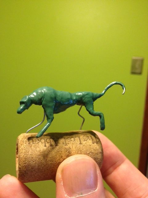
Lastly, I decided to get involved in those monthly sculpt-alongs so I can work on my putty wrangling skills. This month's theme is anime/cartoons.
red1.jpg
 
Back To Top
Top