You are using an out of date browser. It may not display this or other websites correctly.
You should upgrade or use an alternative browser.
You should upgrade or use an alternative browser.
TrystanGST's WIP thread
- Thread starter TrystanGST
- Start date
TrystanGST
New member
I do have plenty of zombie arms, and GSing a coinpurse wouldn't be too hard - I may have to lift the idea!
cannon_fodder
New member
I've got some ripped coin purses from On the Lamb Games I can donate...just PM me.
Could be easy to plop a few at his feet and make it apears as if he's taking another one from the viewer.
Could be easy to plop a few at his feet and make it apears as if he's taking another one from the viewer.
Last edited:
TrystanGST
New member
@cannon - thanks! I found a bunch sitting in my zombie bits box though.
Here's a mock up - first is just the tombstone. Second adds the arm clutching a coinpurse. Placement of one or both is still up for debate. Though seeing the tombstone I'd like to include it somewhere.


Here's a mock up - first is just the tombstone. Second adds the arm clutching a coinpurse. Placement of one or both is still up for debate. Though seeing the tombstone I'd like to include it somewhere.
The Deth and Taxxis(?) mini is very nice. Who makes this model?
I really like the way you have them painted. The skin tone of the female compliments the blues in the skin of the creature. Very well done! I really want to find this model and buy it now.
The ivy on the tombstone looks like a good idea and the fact that you trimmed the tombstone down some and angled it makes it look a lot better than if you have just glued it standing straight up on the base. The Ivy will be better if you paint it dark and have some blue tint in the green of the vives to match the creature. I think the only way the ivy would detract from the model would be if you painted it a very bright contrasting color.
Keep up the good work!
TrystanGST
New member
Thanks guys. I like khthoth's idea of keeping the ivy muted. I will paint it up, and we can see how it looks. I have a bunch of those tombstones, so if it's a bust I can always make another.
*edit* oh - and Deth is made by Hasslefree.
Some work on the Lion Knight - getting close.

*edit* oh - and Deth is made by Hasslefree.
Some work on the Lion Knight - getting close.
TrystanGST
New member
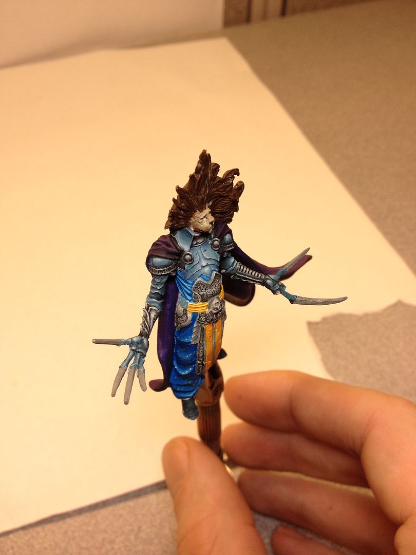
As you can see, he lost a few fingers in transport tonight. Which stinks, because while one was a glue join, the other was actually a resin break. The first I've suffered with a KD mini actually. And it's my fault for not transporting it better. Anyways, blue is almost done. I did what Andy suggested and tried to glaze a little purple here and there, although these phone pics might not show it. Just need to finish the busted hand, do the shoes, and then *gulp* the claws. And the mane. And base him.

TrystanGST
New member
I could have sworn I already posted this here, but Deth is done: http://www.coolminiornot.com/348917
In the end, I decided not to add anything more to the base. That leaves it a little plainer than I had hoped, but since the base he's on wasn't planned around adding things (except maybe Ingrid), ultimately it felt like I was just tacking things on. Better to leave well enough alone.
In the end, I decided not to add anything more to the base. That leaves it a little plainer than I had hoped, but since the base he's on wasn't planned around adding things (except maybe Ingrid), ultimately it felt like I was just tacking things on. Better to leave well enough alone.
Bailey03
Well-known member
Ouch, well at least you didn't lose the fingers. I've broken off my fair share of pieces just from being clumsy while painting. Trying to transport offers all sorts of new dangers!
The lion knight is looking good (even if he is now giving me the finger). Are you planning to base him by himself or will you be using the ladies too? I thought I remembered you painting them a while back... but maybe I'm thinking of someone else. Sorry, I'm too lazy to dig through 99 pages of WIP to find the answer myself. :tongue:
The lion knight is looking good (even if he is now giving me the finger). Are you planning to base him by himself or will you be using the ladies too? I thought I remembered you painting them a while back... but maybe I'm thinking of someone else. Sorry, I'm too lazy to dig through 99 pages of WIP to find the answer myself. :tongue:
cannon_fodder
New member
@cannon - thanks! I found a bunch sitting in my zombie bits box though.
Here's a mock up - first is just the tombstone. Second adds the arm clutching a coinpurse. Placement of one or both is still up for debate. Though seeing the tombstone I'd like to include it somewhere.
I like the tombstone, but 2 things that may help it are:
1. Crack it up a bit...scoll lines in it, or even crumble the top and have it resting against the bottom/ground. A little age would help in this case (not just pale tones)
2. I think the current placement makes the entire picture 'backheavy.' The coin purse is onlt visible from the side. I think I'd move the tombstone a bit closer to his fist...maybe have the coin purse against it....
just a couple thoughts
TrystanGST
New member
Ouch, well at least you didn't lose the fingers. I've broken off my fair share of pieces just from being clumsy while painting. Trying to transport offers all sorts of new dangers!
The lion knight is looking good (even if he is now giving me the finger). Are you planning to base him by himself or will you be using the ladies too? I thought I remembered you painting them a while back... but maybe I'm thinking of someone else. Sorry, I'm too lazy to dig through 99 pages of WIP to find the answer myself. :tongue:
They'll be based separately/together. I have nice Lion themed Scibor bases, which will be placed into a larger base/plinth, like you'd see for a squad entry at certain painting competitions.
Elly3438
Member
Lion Knight is looking good so far. Sucks about the fingers!! >< One suggestion I have that will make the chest area "pop" a bit more - Maybe some definition between the metal plates and the cloth underneath would make those elements stick out a bit more. Right now there is no real line or definition between the elements, so maybe a darker thin line beneath the armor areas would help define everything and make the nmm look even better.
Now don't get distracted with anything else and finish this bad boy up!")
Now don't get distracted with anything else and finish this bad boy up!
TrystanGST
New member
good catch. I didn't even notice that until I went back and looked at the pics. I'm not usually a fan of dark/blacklining, but I think it's almost imperative here.
TrystanGST
New member
Not a lot of time to paint the last few days, but I did get some paint on the base. It's a shame the photo robs a lot of color from the base - it was primed black, based with GW Charadon Granite (dark green-grey), washed with SW Armor Wash (brown-black), heavily drybrushed with P3 Ironhull grey (lighter greenish grey), and then lightly drybrushed with VMC Basic Skintone (pinkish white). Of course the picture just looks grey. The stones still look too uniform, so I need a way to break it up a bit. Of course some of the contrast is lost too. Such is WIP shots I guess.

