Work In Progress

Primeval

New member
Well, I am finally back at the painting table. Some of you may recall a project I posted a WIP here of that is a scene from \"The Frost Giant\'s Daughter\" by Robert E. Howard. The character the story is titled after is a nordic nymph who has hair that is supposed to be a combination of red and gold hair, and my client wanted the emphasis more on the red (most depictions of her usually go toward the blonde). I think I have gottten a pretty good result, but am unsure whether I should perhaps glaze over the highlights with a light yellow tone to tint them more toward a golden red (coppery I guess). Also, I am usually pretty uniform in my highlights but tried to create a more chaotic mix of colors for her hair, does it look ok or did it wind up looking like I missed spots?
Howard\'s description of her hair is (Conan\'s first glance makes him think it is red) \"...neither red nor yellow but a glorious compound of both colors.\"

Oh, and the only thing done is the hair - her eyes and lips will be \"trimmed\" down when I reapply my base coat and start her skin.


atalihairwip2.jpg


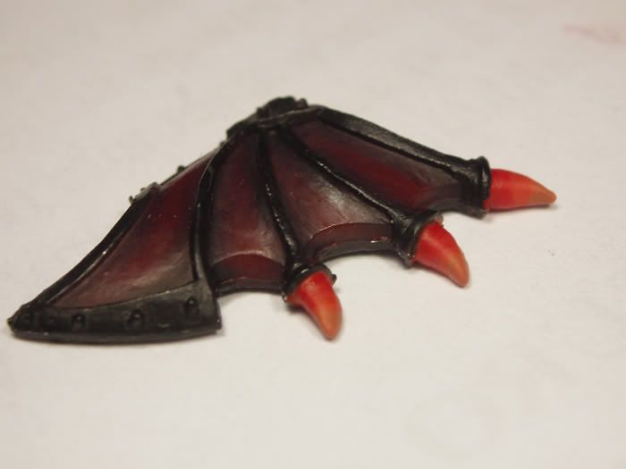
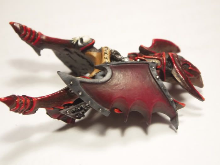
This is the posed project, before I started any conversions or painting:


fgdwip2.jpg
 

Jabberwocky

New member
@Cukier: The base is looking good. I like the stream. The choice of colors is good. Gold and purple is always a good choice :).
@Abstract: I agree the drum is a nice touch on the gun.
@NSA: Cute lil guy!
@Primeval: I think you have done well with the coloring. In an attempt to make it more \"coppery\", have you considered a very thin glaze of a copper metallic? A bit out on a limb admittedly, but the sheen of the copper might befit a magical nymph (or totally screw up your work and earn her a trip to the paint remover cup lol).

Jabber
 

tidoco2222

Active member
As is usual there is some very nice work going on here, anyway here is the latest pics of my Orc that I am doing as part of the mini swap project and it is very nearly finished. I am pleased with how it is turning out,

MiniswapOrc002.jpg


MiniswapOrc003.jpg


There is a very nasty injection point on his back which because of where it is situated is very difficult to get to so I intend to cover it with a shield that I have found in my bits box which will do the trick, I am also planning on painting a tribal tattoo on his shoulder and down part of his back.

Hope you all like it as much as I do. :D
 

ipaintminis

Active member
@tim-WOW its looking amazing! really really good. i wont be shocked when you pick up a deamon!
@primevil- no i like the red look, i wouldnt change any of the highlights...it looks great...nicely done!
 

Fizl

Secret Crocodile
@Tidoco - if he is a plastic or resin, couldn\'t you carefully melt that injection area away with some acetone on a cotton bud? Maybe turn it into a scar or an unfortunate war wound? Seems such a shame to hide his back with a shield!

Shaz
 

tidoco2222

Active member
Thanks guys I had thought abought trying to remove it but the would be too much liklyhood of damaging the are of detail where the strapping is. The shield I have is not too big in fact it would probably end up looking like a piece of armour more than a shield. It actually came from a Dragonrune Orc and this chap is quite a lot bigger than those so it shouldn\'t look too bad.(Hopefully)
 

stef686

Member
Looking really great Tim, someone said they wont be suprised if you pick up a demon, just wondered if you\'re going to Golden Demon this year? :p

Cant wait to see it finished!
 

Ritual

New member
Nice work Tim! I could swear you have improved during the month I\'ve been inactive here! :) The skin is incredibly smooth and your metallics are great!
 

green stuff

Active member
Message original : tidoco2222
as for demons it is not likely as I never enter lol.
???

Must be something in the english air :p.

Still looking really great. Have you thought off giving a deluted blue wash to darken some skin shadows?
 

tidoco2222

Active member
Cedric I may do some deeper shading here and there but I realy do not want to spoil the look of it, it is not quite as bright as it loks in the pic as the lightsource is giving a bit of a false impression.
I may shade around the veins down its arms and then pick out the ridge in a lighter shade as well as the tattoo which I have yet to come up with a satisfactory design. Watch this space as they say but the time is starting to run out for miniswap three and I want to get at least one of these great minis you sent finished. :p
 

Duende

New member
*sigh*

Well, I don\'t believe I\'m gonna try to follow Tim\'s amazing piece of work with my barely started mini, but here goes...

First of all, I\'m sorry I haven\'t posted here in a while, but my last WIP was a wereshark so I hope you understand why there\'s no wip\'s of that :D !

So now, I started one of my favorite minis that I hope to do justice by; Dark Age\'s Dragyri Death\'s Device.

I\'ve only just been working on his skin so far, I wanted to try a coloration different from other Dragyri I\'ve seen. The base color I used is actually a mix of three different Vallejo Model colors mixed in a 2:3:3 ratio. The lighter and darker areas were made by using another 3 colors in with my first. I\'ve tried to give his skin a lighter appearance in the face, chest, inner arms and thighs area, while darkening his back and outsides of his arms, thighs, and lower legs. I also added some black \"freckling\" on his cheeks and other areas, which may be hard to see in the pics. I\'ve also made some small modifications in that I\'ve switched his \"back shield\" with the Shadow Walker\'s and smoothed out the notch in the shoulder blades.

So, I\'d like to hear any opinions on what I\'ve done so far. Also, I\'d like to hear any suggestions on what color to make the armor. I do have an idea in mind, but wouldn\'t mind suggestions!

So without further ado, Death\'s Device:

DDwip2.jpg
 

tidoco2222

Active member
@ Duende I like the skin tone and the idea of the freckling is a good one, I myself would have taken the highlights up a stage further but then that is just me.
I think to pull the look off for this one you will need to give a good contrast in the armour so as the skin tone can be appreciated.
I have seen one of these done with senmm armour and that looked realy effective you may want to consider something like that.
 

Primeval

New member
@jabberwocky - that is a good idea, but I think I would probably mess it up with my luck, but I will have to use it on another figure!

@ipaintminis - thanks Becca, after going back and comparing it to the hair on the reference model I had I think I have the color I need, so red it will stay!

@tidoco2222 - amazingly smooth work on that skin Tim! About that nasty little injection point - why not just take some green stuff and attach it to the larger metal ring and make it look like part of the ring where those straps meet? Maybe 2 little strips attached vertically to between the rings would do it. Just an idea...
 

Klute

New member
Berni....those are looking real nice.The shield close ups show some good blending.
And welcome to the forums.

Among other things here is a Butcher that I er um BUTCHERED.
I got busy with the snips and dremmel and just about stripped this guy bare.I kept the peg leg though changed the look.I didnt like all the bones stickking in the skin etc so they came off.Also that mouth with the big teeth is just too ugly,so I had at it with the dremmel too.I changed the serrated blade to a cleaver and clipped the tenderiser from the spare arm and made a big hammer from it for the other hand.
I kept his apron and the 2 skulls on it.Ive added some extra flab to the big guy.I have pretty much reshaped the whole face too.
What I want to know....is he still classed as a butcher?
butcherwip.jpg
 

ipaintminis

Active member
to butcher or not to butcher

with that meat cleaver...i would definatly say he is a butcher. and i dont see why he wouldnt be! :D
 
Back To Top
Top