@talonicus
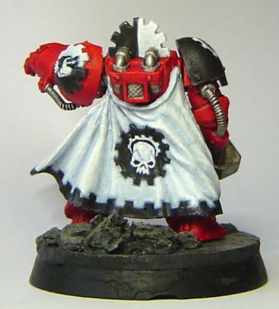
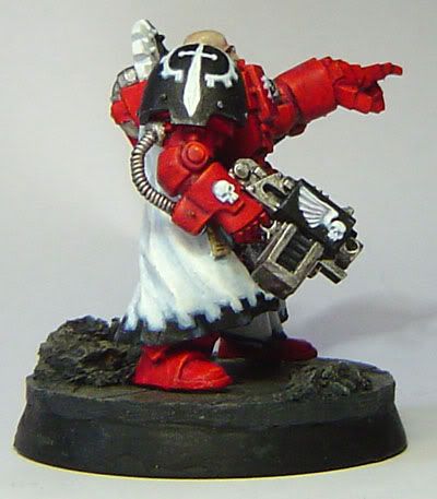
the highlighting on that fist is really off, someone mentioned it earlier i think
the backpack looks gorgeous though, i think its perfect, however your blending techniques seem to deviate alot part section to section(you may not be done i dont know)... the rear legs look different than the backpack and the front arms, the front legs look different from everything...etc
i dont have the model, but i think the dark brown on the bone chest might come out a bit too far, however if its more curved than it looks i think its alright
annd i think you might have too much white on your gold, ive never seen gold shine that much white, the best gold on your model is the piece where the hose attaches on the fist(front view) more yellow minimal white, but this is from looking, not from an experienced NMM(just started

)
love the hand painted designs and such
@hate the state
i agree with other comments, the face is over defined, but the battle damage and weathering is looking very nice so far
@matthewbaich
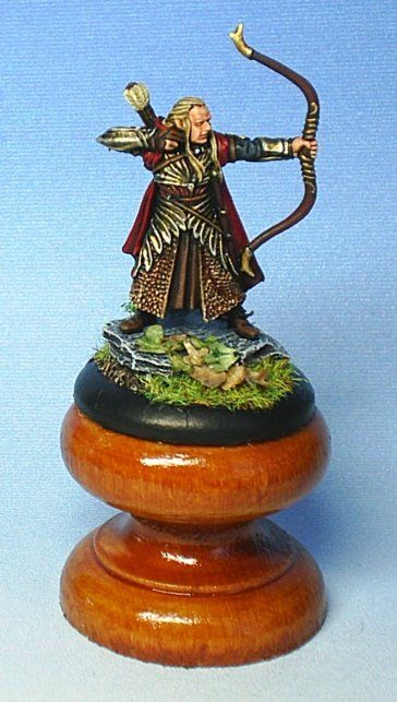
i agree again with other comments, that it seems to be that the gold and the skin have the same tone, and because of that the gold really doesnt give the feel its supposed to
also with the red hair and the redish skin, again neither seem to deliver, try:
-lightening up the skin by adding more highlights
-add brighter and darker highlights to the gold, its ok to have some black in the very deep recesses, and its ok to have bleached bone/white(i like bone as a final highlight because its not pure white and holds a yellow/brown shade to it)
- quit using the same general tones for washes(oranges/reds/browns)
however if the hair was orange it might look a bit better(but red can be done well with ideas mentioned above i believe)
Starks