Works in Progress IV

Wolf Fang

Member
Originally posted by Aragorns mate
hey wolf fang, looking good

love the little guy being squashed under the warrior, gona look brilliant when finished

thanks :) however the gaunt isnt being squished. the gaunt has been shot and the warrior is moved in close 2 protect it and avenge its death. atleast that was my idea. people always say the tyranids are heartless im trying to show otherwise lol
 
Here he is in his finished state, he will not be changed now as I have sold him, but better pictures as promised.

I shall post him on CMoN when i have edited the image together as one

AMF1.jpg

AMF2.jpg

AMF3.jpg

AMF4.jpg

AMF5.jpg

AMF6.jpg


AI
 

Aragorns mate

New member
@ wolf fang: my bad, i thought the blood was where the warrioer was standing on him xD still looks great :)

@ abstract: real night work there bud, absolutely love the face, very realistic, only criticism would be the armout looks a little flat, would have jsut enchanced it by having a few more shadows and highlights, but still great work.

if you dont mind me asking how much did you get for him?

- Gez
 

tidoco2222

Active member
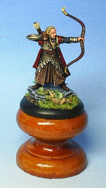
This no longer a WIP but I thought you might like to see the end result. Here is my version of Haldir a very detailed model which made it difficult but fun to paint all the same.

ArmouredHaldirFront.jpg


ArmouredHaldirBack.jpg


Hope you like it.
 

Ghaffasa

New member
My WIP blood dragon vampire. The only finished part is the armour. The cloak is just basecoated. Feedback appreciated.


pic.php
 

EPStudios

New member
@Ghaffasa- Stop double posting.:flame: Those ultramarine legs are looking pretty good so far. Try to get better pictures though.

@MathewBaich- The entire miniature is missing its darks and lights. Everything is too close to the standard colors. Work on that chiaroscuro.

@Wolf Fang- That bottle top is the actual stand you\'re going to be using?... I\'d advise against that. Also, typically imo tyranid \"scales\" look better with vertical streaks of paint instead of the horizontal lines that you are using. That and that warrior gun is simply too big. Nice earthy color palette though.

@HateTheState- The recesses in your terminators face are too dark in comparison to the rest of his face. You should try to smooth that out by using some glazes.
 

Talonicus

New member
@ MathewBaich Your dwarf seems very flat. I think you need to highlight and shadow him much more.

@HateTheState your termie is starting to look great. The armour could do with more definition but I can see its early days.

@Wolf Fang the Tyranid is looking great. I must paint some of these up soon. I like the colour scheme but at the moment they are also looking a bit flat. Highlights are your friend. :)

@Ghaffasa what I can see looks good but the photo is really to small to judge properly.

@abstract incendiarie I really really like what you have done with this figure. I just think that if you had spent longer on the armour it could of been outstanding.

@tidoco2222 That little guy looks fantastic. Those lotr minis are small and fiddly and you have done a great job.

@angus147258 what I can see looks ok but the photo is very very dark.

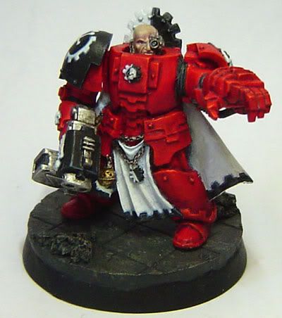
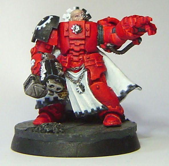
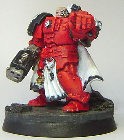
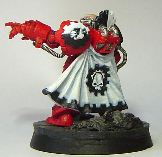
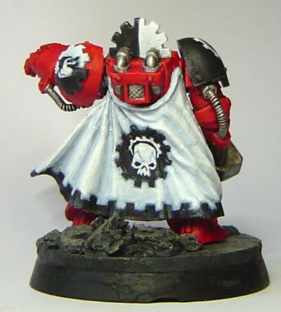
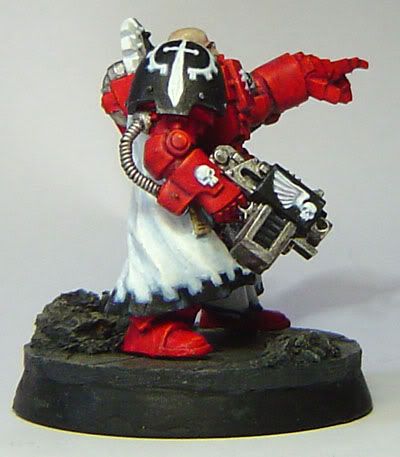
Well this will the last post of my chaplain. I have just a few bits and pieces left. I have changed the various parts that people have noticed to be wrong so im hoping all are happy now. :D


Lysander has now started to move along. I am going for a battle damaged model this time. Still early days.


Comments welcome please.


chaplainlatestfront.jpg

chaplainlatestback.jpg

lysander2.jpg
 

Wolf Fang

Member
for the highlights there are some only not exagerated, and the cam doesnt really pic them up. as for doing the carapace viticaly if your saying what i think your saying i am doing it that way..:rolleyes: il\'l get some better pics later. also everything is already glue on the base (except the gaunt) as its all i had... are you sudgesting to hack the bottom off?
 

misterjustin

New member
Slaanesh Penitent Engine WIP

Aside from the converted Nurgle Champion I\'m also still working on my Emperor\'s Children army. I still don\'t have the ideas I\'m looking for on the penitent engine conversion, but I\'ve started the legs as they\'re my favorite part of the model.

129838127_5fad32eb6a_o.jpg


Still a good deal of highlighting to do, as well as some detailing, but I\'m very happy with the \"oily\" look I\'ve achieved on the hydraulic bits.

Feedback is, of course, appreciated. After a couple of requests I\'ll also shrink the images a bit and stop linking to them.

Thanks in advance.
 

Ghaffasa

New member
@Mathewbaich: He looks good. Perhaps the hair could use some more highlights, but that\'s just a matter of taste.
@EPstudios: Sorry for the double posts, it wont happen again.
@Talonicus: Lysander\'s face looks awesome. Perhaps his armour could use some more depth.
@misterjustin: Great metallics, it\'s a bit difficult to separate the details, but from what i can see it looks good.
 

HateTheState

New member
Talonicus: The chaplin looks great, and lysander freehand it´s very good

Misterjustin: It´s a strange mini but i like it a lot.

Here continues my termi, the armour it´s more darked and I´ve added dust and damages
tersig37tx.jpg
 

Starks333

New member
@talonicus

the highlighting on that fist is really off, someone mentioned it earlier i think

the backpack looks gorgeous though, i think its perfect, however your blending techniques seem to deviate alot part section to section(you may not be done i dont know)... the rear legs look different than the backpack and the front arms, the front legs look different from everything...etc

i dont have the model, but i think the dark brown on the bone chest might come out a bit too far, however if its more curved than it looks i think its alright

annd i think you might have too much white on your gold, ive never seen gold shine that much white, the best gold on your model is the piece where the hose attaches on the fist(front view) more yellow minimal white, but this is from looking, not from an experienced NMM(just started :D)

love the hand painted designs and such

@hate the state

i agree with other comments, the face is over defined, but the battle damage and weathering is looking very nice so far

@matthewbaich

i agree again with other comments, that it seems to be that the gold and the skin have the same tone, and because of that the gold really doesnt give the feel its supposed to

also with the red hair and the redish skin, again neither seem to deliver, try:

-lightening up the skin by adding more highlights

-add brighter and darker highlights to the gold, its ok to have some black in the very deep recesses, and its ok to have bleached bone/white(i like bone as a final highlight because its not pure white and holds a yellow/brown shade to it)

- quit using the same general tones for washes(oranges/reds/browns)

however if the hair was orange it might look a bit better(but red can be done well with ideas mentioned above i believe)

Starks
 

Talonicus

New member
@starks333

The armour highlighting technique is the same throughout the model, its probably just the photo to me in person it looks exactly the same.

The fist I have repainted 3 times now. I am sure that the highlight is in the correct place and the intensity of the gleam seems ok, I am not sure what to do about this damed fist. :)

The gold I think you are correct about, looking at it again..(1 million times now and counting) it does seem to be over highlighted.

Thanks for all the critiques, keep em coming.

:D
 
Back To Top
Top